Making Text Legible: Designing for People with Partial Sight.

| Effective Color Contrast
Designing for People with Partial Sight and Color Deficiencies by Aries Arditi, Ph.D
How does impaired vision affect color perception? Partial sight, aging and congenital color deficits all produce changes
in perception that reduce the visual effectiveness of certain color combinations.
Two colors that contrast sharply to someone with normal vision may be far
less distinguishable to someone with a visual disorder.
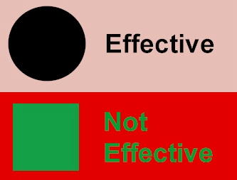
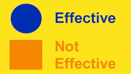
Exaggerate lightness differences between foreground
and background colors, and avoid using colors of similar lightness adjacent
to one another, even if they differ in saturation or hue.
Don't assume that the lightness you perceive will be the same as the lightness perceived by people with color deficits. You can generally assume that they will see less contrast between colors than you will. If you lighten your light colors and darken your dark colors, you will increase the visual accessibility of your design.
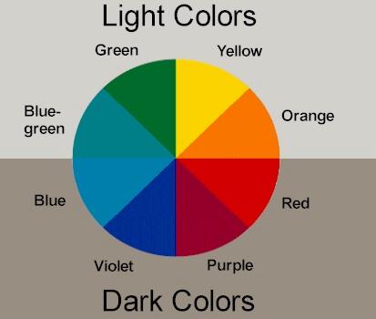
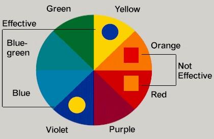
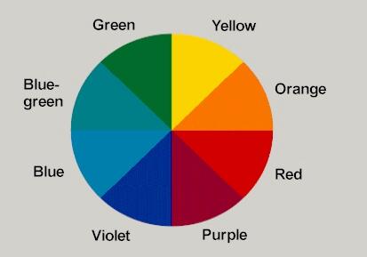
Choose dark colors with hues from the bottom half of
the hue circle against light colors from the top half of the circle. Avoid
contrasting light colors from the bottom half against dark colors from
the top half.
For most people with partial sight and/or congenital color deficiencies, the lightness values of colors in the bottom half of the hue circle tend to be reduced.
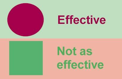
Avoid contrasting hues from adjacent parts of the hue
circle, especially if the colors do not contrast sharply in lightness.
Color deficiencies associated with partial sight and congenital deficiencies make it difficult to discriminate between colors of similar hue.
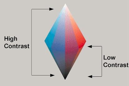
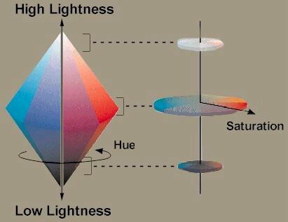
Hue varies around the solid; lightness varies from top to bottom and saturation is the distance from the center.
Hue is the perceptual attribute associated with elementary color names. Hue enables us to identify basic colors, such as blue, green, yellow, red and purple. People with normal color vision report that hues follow a natural sequence based on their similarity to one another. With most color deficits, the ability to discriminate between colors
on the basis of hue is diminished.
Lightness corresponds to how much light appears to be reflected from a surface in relation to nearby surfaces. Lightness, like hue, is a perceptual attribute that cannot be computed from physical measurements alone. It is the most important attribute in making contrast more effective. With color deficits, the ability to discriminate colors on the basis of lightness is reduced.
Saturation is the degree of color intensity associated with a color's perceptual difference from a white, black or gray of equal lightness. Slate blue is an example of a desaturated color because it is similar to gray. A deep blue, even if it has the same lightness as slate blue, has greater saturation. Congenital and acquired color deficits typically make it difficult to
discriminate between colors on the basis of saturation.
To a person with color-deficient partial sight, the left-hand panel might appear like the right-hand panel appears to a person with normal color vision. With color deficits, ability to discriminate colors on the basis of all three attributes - hue, lightness and saturation - is reduced. Designers can help to compensate for these deficits by making colors differ more dramatically in all three attributes. Lighthouse International has a companion brochure entitled "Making Text Legible: Designing for People with Partial Sight." Follow this link
to find out about Lighthouse International's Large Type Campaign
Dr. Arditi is an expert in vision science. This brochure is based on his earlier work with Kenneth Knoblauch. ©1995-1997 The Lighthouse Inc. ©2002 Lighthouse International. All rights reserved. Arlene R. Gordon Research Institute
If you have any questions or comments about our site, please E-mail the webmaster. If you would like more information on low vision, vision rehabilitation or Lighthouse International programs, please E-mail info@lighthouse.org. |

