Using ggplot2
(libraries used include ggplot, ggvis, MASS, reshape2, ggthemes, tidyverse, ggrepel)
Using ggplot2 and qplot: Method Overview
The ggplot2 library is a follow-up of the ggplot library, and stands for the ‘grammar of graphics’. It produces attractive, professional-looking graphics that are good, especially for presentations. This comes at a cost of some of the flexibility that standard R graphics give, but it is often worthwhile. The ggplot2 library was developed by Hadley Wickham, who also developed reshape2 and dplyr and the rest of the tidyverse. Because of its peculiarities, you may end up needing to use these other libraries to make full use of its power.
There are a lot of basic introductory tutorials for ggplot out there. See links in the resources below. Note that ggplot supports dozens of base plot types, and by combining and overlaying different kinds of visualizations it has incredible flexibility and power. This introductory lesson covers the basics, but there are many other options.
Finally, ggplot has pretty nice control over the graphics formats you save. It has functions that will create several different formats directly, with specified dimensions and dpi, so you are not at the whim of the RStudio window for creating your figure resolutions.
There is a similar graphics library being developed by the developers of ggplot2 called ggvis, which intends to make interactive web graphics. If you understand ggplot2, ggvis should be easy to pick up and let you do some exciting things.
Overview of Functions
There are two main ways to use ggplot2. The grammar-of-graphics way (using the ggplot() function) can be difficult to get started with but offers a lot of power. The simple way works more like traditional R graphics (using a function called qplot) is more straight-forward, but can be a bit more limiting. You can mix the two as well.
The basic idea of ggplot is that it is a composable grammar that has variables represented deliberately in its structure. In core R graphics, you create lines and points and layers, and what you did is lost. This means if you want to add a legend, you have to manually determine what it means. If you want to add additional adornment to a specific variable, again you do it manually. In ggplot, you create a baseline object using the ggplot function, and then you modify it by adding (with the + sign) additional graphical elements that understand the data you specified. This is a bit strange to get used to, so first we will look at a way to access much of the same output, but without the grammar, and instead with just arguments to the qplot function.
The more traditional way: qplot
The qplot method for using ggplot is an approach that might be easier
to use initially, but it is not used frequently in the wild. Most
tutorials on ggplot show the other methods, and so the capabilities of
qplot are limited. We will cover a basic introduction, but will try to
focus more on ggplot’s normal methods. qplot stands for
quickplot, and either function name can be used. It wraps
up all major plotting methods into one function. If we look at the
function definitions, some of the arguments are similar to what appear
in the normal plot() functions: you specify x and y values,
labels, limits, etc. The geom argument specifies what type
of plot you want to create.
qplot(x, y = NULL, ..., data, facets = NULL, margins = FALSE,
  geom = "auto", stat = list(NULL), position = list(NULL), xlim = c(NA,
  NA), ylim = c(NA, NA), log = "", main = NULL,
  xlab = deparse(substitute(x)), ylab = deparse(substitute(y)), asp = NA)
Let’s look at the crabs data set in the MASS library. This data set has 200 observations of crabs (100 male and 100 female) on 5 different measures, with two species (blue or orange). The other variables include FL=frontal lobe size; RW rear width; CL=carapace length, CW = carapace width, BD = body depth.
library(MASS)
library(ggplot2)
library(tidyverse)
head(crabs)
sp sex index FL RW CL CW BD
1 B M 1 8.1 6.7 16.1 19.0 7.0
2 B M 2 8.8 7.7 18.1 20.8 7.4
3 B M 3 9.2 7.8 19.0 22.4 7.7
4 B M 4 9.6 7.9 20.1 23.1 8.2
5 B M 5 9.8 8.0 20.3 23.0 8.2
6 B M 6 10.8 9.0 23.0 26.5 9.8Let’s look at the frontal lobe width. Doing qplot with one continuous variable will just plot a histogram.
qplot(crabs$FL)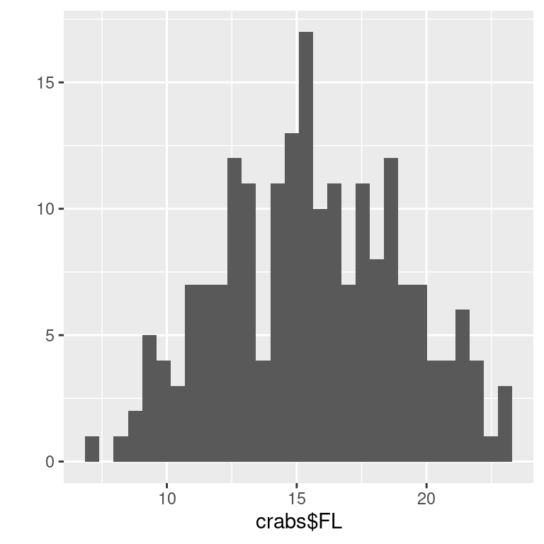 I’m not enamored with how this looks. Let’s spruce it up a bit:
qplot(FL, data = crabs, xlab = "Frontal lobe size (mm)", main = "Crab frontal lobe size",
    binwidth = 1)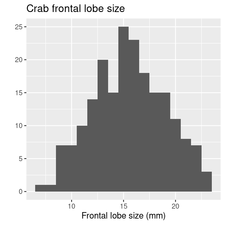
This looks a lot like we would use normal plot functions. But ggplot uses another method to put adornments and styles on a plot. In this approach, you add a function to the end of the base plotting function to change its look. We can do this with qplot as well, so let’s do this to get accustomed to the grammar of graphics approach I also like to use a different theme:
qplot(FL, data = crabs, binwidth = 1) + xlab("Frontal lobal size (mm)") + ggtitle("Crab frontal lobe size") +
    theme_minimal()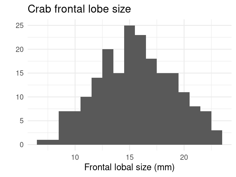
We can see that the qplot function offers arguments to set graphical parameters, but any argument within qplot can be added outside of the function by adding them to the expression.
Unlike normal plotting functions, ggplot returns an object that
represents the graph. That object can be saved and used later, or saved
and changed with other ggplot elements. One reason this is handy is to
create a page with multiple figures on it. Previously we would have used
par(mfrow=c(1,2)) to set a page with two columns and one
row, but ggplot does not support that graphic model. Although adding
multiple figures together is not easy to do in the base ggplot library,
the ggExtra libray provides a function called grid.arrange
that will help us out.
While we are at it, suppose we want to plot something besides a
histogram. Because ggplot supports a lot of different types of graphing
(e.g., histograms, line plots, scatter plots, polygons, etc.), you need
to specify the type. qplot has an argument that lets you do this,
although by default it shows a histogram. Instead of a histogram, maybe
we want a scatterplot showing the FL size across each row of data, you
can do this by specifying x and y values. Here, we will specify FL as
either an X value (it will make a histogram) or the y value (it will
make a scatterplot). We will save each to a variable. We can output them
individually be evaluating or print()ing the object, or we
can use grid.arrange to plot them together. However, we can also specify
the geom argument to force it to use some format. In p3
below, we plot a line graph instead of a scatterplot.
library(gridExtra)

p1 <- qplot(data = crabs, x = FL) + xlab("Frontal lobal size (mm)") + ggtitle("Crab frontal lobe size") +
    theme_minimal()
p2 <- qplot(data = crabs, x = index, y = FL) + xlab("Crab Index") + ggtitle("Crab frontal lobe size") +
    theme_minimal()
p3 <- qplot(data = crabs, x = index, y = FL, geom = c("point", "line")) + xlab("Crab Index") +
    ggtitle("Crab frontal lobe size") + theme_minimal()
p2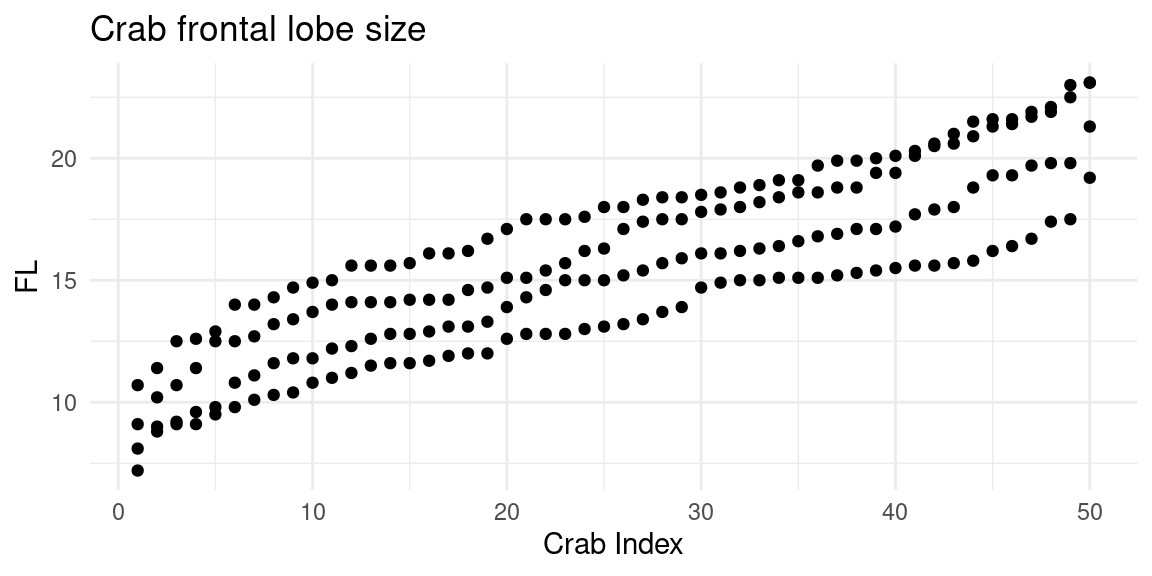
print(p1)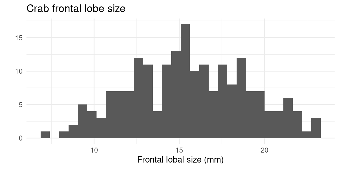
grid.arrange(p1, p2, p3, ncol = 3)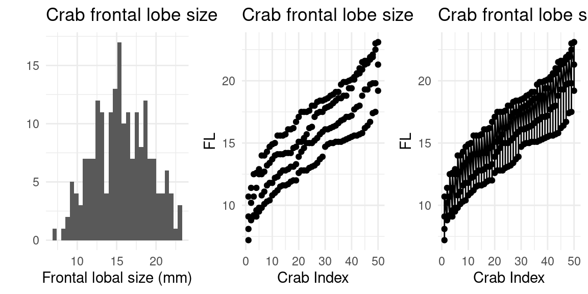
Using ggplot() instead of qplot
The qplot function tries its best to figure out what you
want to plot, and you can specify geom argument to make a specific type.
But the geom argument is just a way of specifying a graph type via the
gg grammar model. If we didn’t have qplot, we would instead use
ggplot as the base function, and add the graph type by
adding a geom_ function. Within ggplot(), there is an
argument called aes which lets us specify all data that
should get mapped to aesthetic elements of the graph. That is, any data
mapped to something in the graph goes within aes(), while
other graphical aspects outside of aes() are not dependent
on data. Let’s recreate the figure above using the bare
ggplot function.
library(gridExtra)

p1 <- ggplot(data = crabs, aes(x = FL)) + geom_histogram(col = "black", fill = "gold") +
    xlab("Frontal lobal size (mm)") + ggtitle("Crab frontal lobe size") + theme_minimal()
p2 <- ggplot(data = crabs, aes(x = index, y = FL)) + geom_point(shape = "x") + xlab("Crab Index") +
    ggtitle("Crab frontal lobe size") + theme_minimal()
p3 <- ggplot(data = crabs, aes(x = index, y = FL)) + geom_point(size = 0.5) + geom_line(color = "darkgreen") +
    xlab("Crab Index") + ggtitle("Crab frontal lobe size") + theme_minimal()

grid.arrange(p1, p2, p3, ncol = 3)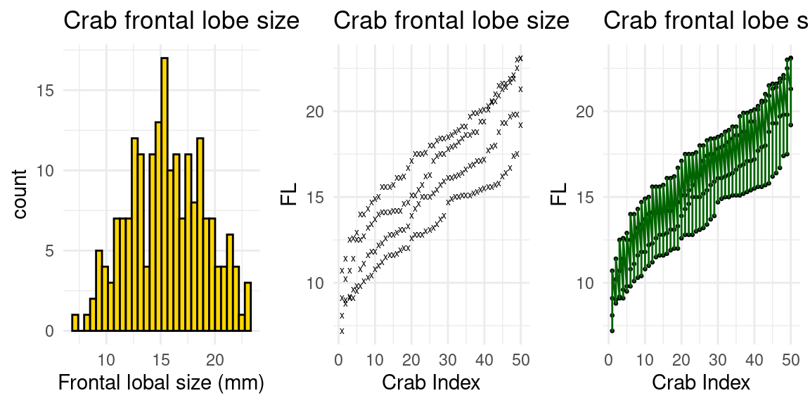
Looking at the code above, I basically put the data within
aes() and then added appropriate geom_()
arguments. In each case, I changed some overall graphical elements
within the geom_() argument functions, which makes it
easier to isolate changes to specific aspects. From now on, we will use
ggplot() instead of qplot(), but keep in mind
that a histogram with qplot() is really easy, and sometimes
it gets complicated with ggplot.
Legends and scales
One advantage of ggplot is because it knows the meaning of variables,
it automatically adds legends when you have multiple series specified by
a graphical element other than x and y. For example, suppose we want to
plot crabs$FL by crabs$CL, but specify species
with different colors and sex with different symbols. Here, I will also
use a magrittr pipe to pipe data into ggplot:
crabs %>%
    ggplot(aes(x = FL, y = CL, color = sp, shape = sex)) + geom_point(size = 3) +
    theme_minimal()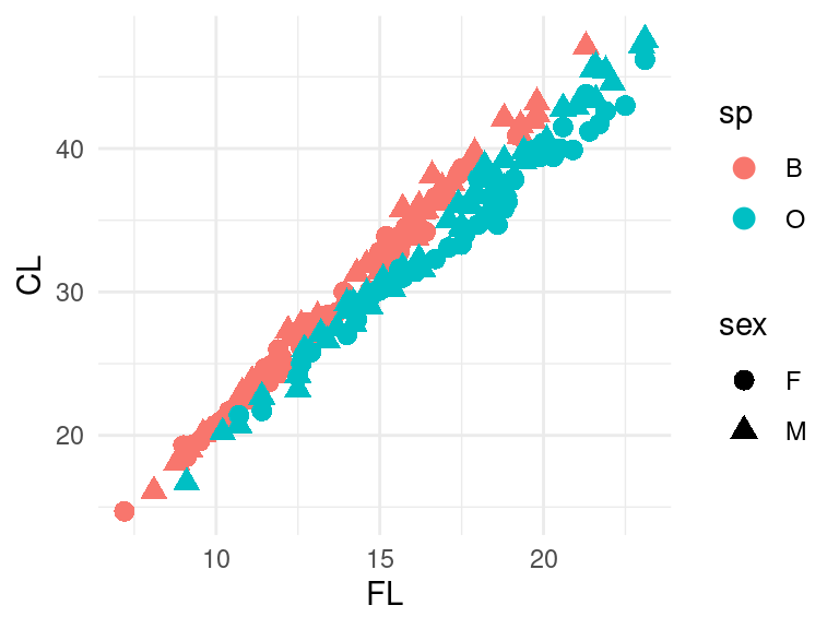
Here, I increased the size of the symbols within
geom_point(), and mapped species to color and sex to shape.
The legend labels are not great. We could fix this using dplyr::rename
and mutate/recode:
crabs %>%
    rename(`Frontal Lobe` = FL, `Carapace Length` = CL, Species = sp, Sex = sex) %>%
    mutate(Species = recode(Species, B = "Blue", O = "Orange")) %>%
    ggplot(aes(x = `Frontal Lobe`, y = `Carapace Length`, color = Species, shape = Sex)) +
    geom_point(size = 3) + theme_minimal() -> gcrab
gcrab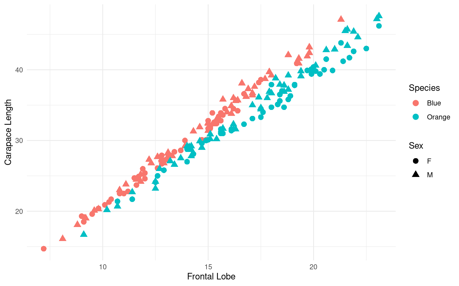
This is a bit difficult because we have changed the data to get the graph right, but because we used a pipeline, it did not impact the original data. Alternately, we could keep the data and change the labels. We can use gcrab and try this–at least adding the unit of measurement to the axes and legends:
gcrab <- gcrab + xlab("Frontal lobe (mm)") + ylab("Carapace length (mm)") + labs(color = "Crab species") +
    labs(shape = "Crab sex")

gcrab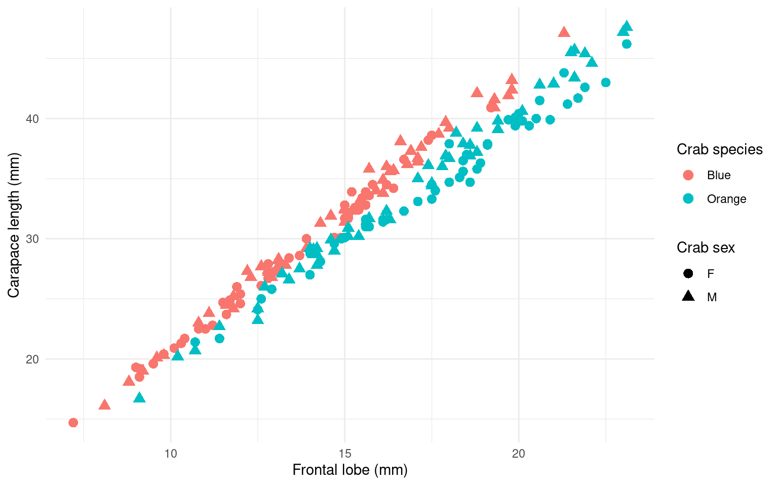
We didn’t really need to recode and rename, except for Blue/Orange which seems reasonable to actually change in the data frame.
Notice though that the color scheme does not match the actual color
of the species. Changing color mappings is more difficult. These are
addressed either with themes or the scale_() argument. There are
several, and different ones for continous and categorical color scales,
but here the simplest way to go is use
scale_color_manual(). Because we have saved this object as
gcrab, we can try out changes to that object by adding grammar elements.
Lets try four different schemes:
grid.arrange(gcrab + scale_color_manual(values = c("blue", "orange")), gcrab + scale_color_manual(values = c("blue4",
"orange2")), gcrab + scale_color_manual(values = c("cadetblue4", "orange")),
gcrab + scale_color_manual(values = c("navy", "gold")), ncol = 2)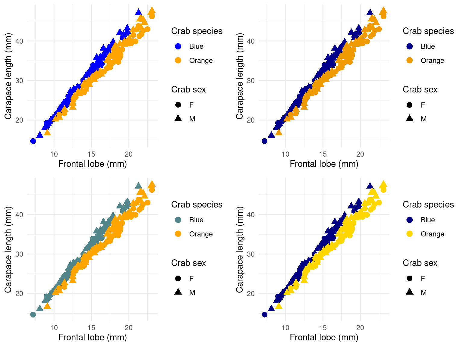 Which do you like the best?
Aesthetic and grouping variables in ggplot
Within the aes() argument, you can specify many aspects
of the visual display of the object. Typically these will include:
color/colour: the color of the object or often the outline of the object.fill: the color of how the object is filledshape: the color of a plotting shape (symbols similar to the pch argument in plot())size: the size of the line or symbolstroke: the size of the ‘outline’ of a point, for those points with a distinct outline and fill (like shape=21)alpha: the transparency of the plotting colorlinetype: solid,dashed, dotted,etc. for lineslinewidth: width of a linelinejoin,linemitre,lineend: style of line endings/corners
There are others linked to specific distinct geom types. Each of
these can be set either within ggplot, or within the
geom_() to override the default value in
ggplot(), and they can be set within an
aes()–linked to a data value, or outside the
aes()–applied universally to all aspects. In addition to
these, there is also a ‘group’ variable which helps create connected
data series–especially useful for lines or when you have multiple
IVs.
As an example, lets aggregate mean CL and FL, and then make it a long data format:
crabs2 <- crabs %>%
    rename(Species = sp, Sex = sex) %>%
    mutate(Species = recode(Species, B = "Blue", O = "Orange")) %>%
    group_by(Species, Sex) %>%
    summarize(meanCL = mean(CL), meanFL = mean(FL)) %>%
    pivot_longer(cols = meanCL:meanFL)
crabs2
# A tibble: 8 × 4
# Groups: Species [2]
Species Sex name value
<fct> <fct> <chr> <dbl>
1 Blue F meanCL 28.1
2 Blue F meanFL 13.3
3 Blue M meanCL 32.0
4 Blue M meanFL 14.8
5 Orange F meanCL 34.6
6 Orange F meanFL 17.6
7 Orange M meanCL 33.7
8 Orange M meanFL 16.6crabs2 %>%
ggplot(aes(x = Sex, y = value, color = Species, shape = name)) + geom_point() +
geom_line() + scale_color_manual(values = c("cadetblue4", "orange")) + theme_minimal()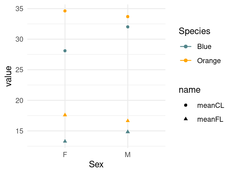
This looks strange. We want each series connected, but even with a
geom_line() nothing happens. This is because we need these
values grouped. We essentially need to specify a variable to create
groups by in the original data. Since we want each unique combination of
species and name to be in a group, this is easy to do with a
paste() command within a mutate() function.
I’ll clean up the figure a bit as well:
crabs2 %>%
    mutate(crabgroup = paste(Species, name)) %>%
    ggplot(aes(x = Sex, y = value, color = Species, shape = name, group = crabgroup)) +
    geom_point(size = 3) + geom_line(aes(group = crabgroup)) + scale_color_manual(values = c("cadetblue4",
    "orange")) + theme_minimal() + ylim(0, 40)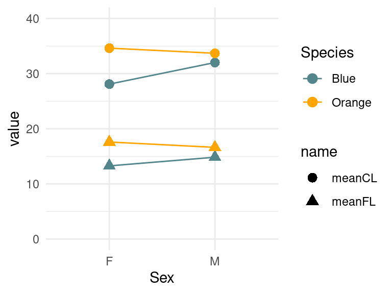
Normally, if you are having trouble with lines looking strange, the answer is to create and use a grouping variable.
Faceting
What if we wanted a separate plot for each species, instead of
plotting a different symbol. We can use faceting to make separate plots
for each level of another variable. Facets can be added using either the
grammar element facet_wrap() or facet_grid().
See https://ggplot2.tidyverse.org/reference/facet_wrap.html
We could facet by two variables into a grid as well.
gcrab + scale_color_manual(values = c("navy", "orange")) + facet_wrap(. ~ Sex)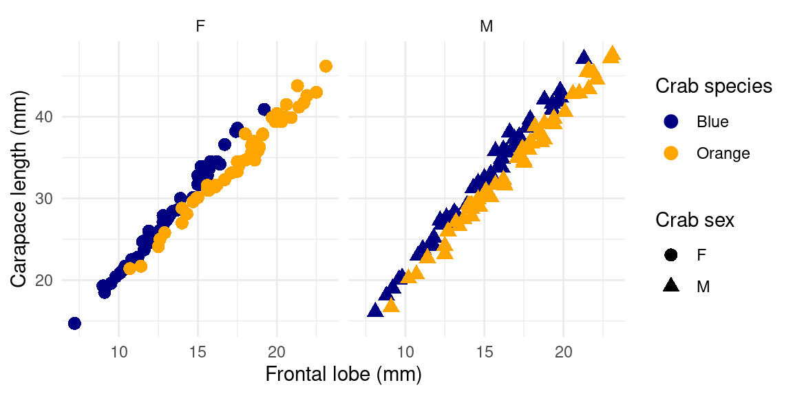
gcrab + scale_color_manual(values = c("navy", "orange")) + facet_grid(Species ~ Sex)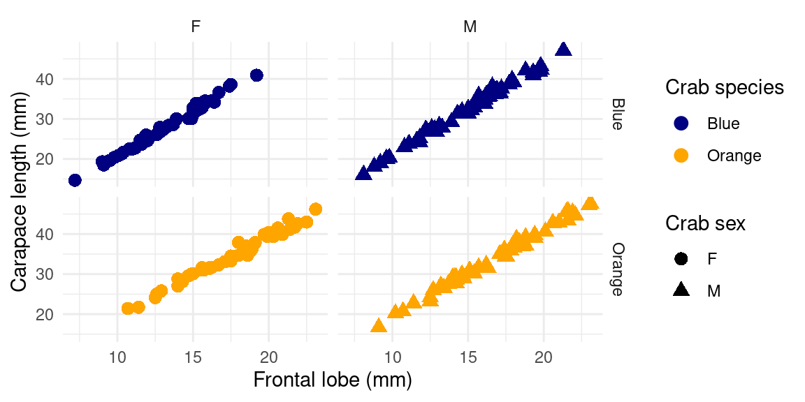
Boxplots
Another kind of geom_ is the boxplot (see https://ggplot2.tidyverse.org/reference/geom_boxplot.html).
Here, the color of the boxplot is specified by ‘fill’ (the outline is
specified by color). So the manual color mapping is now
scale_fill_manual
crabs %>%
    mutate(Species = recode(sp, B = "Blue", O = "Orange")) %>%
    ggplot(aes(y = FL, x = Species, fill = Species)) + geom_boxplot() + xlab("Frontal lobe size (mm)") +
    ggtitle("Crab frontal lobe size") + theme_grey() + scale_fill_manual(values = c("navy",
    "orange"))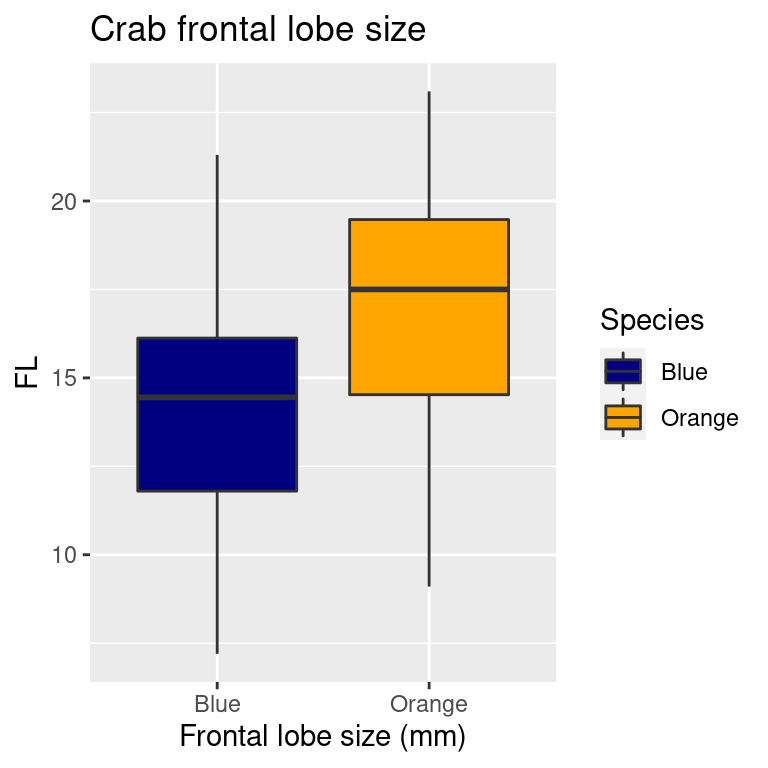
You could add the points on top of these by adding
geom_point():
crabs %>%
    mutate(Species = recode(sp, B = "Blue", O = "Orange")) %>%
    ggplot(aes(y = FL, x = Species, fill = Species)) + geom_boxplot() + geom_point(color = "grey20") +
    xlab("Frontal lobe size (mm)") + ggtitle("Crab frontal lobe size") + theme_bw() +
    scale_fill_manual(values = c("navy", "orange"))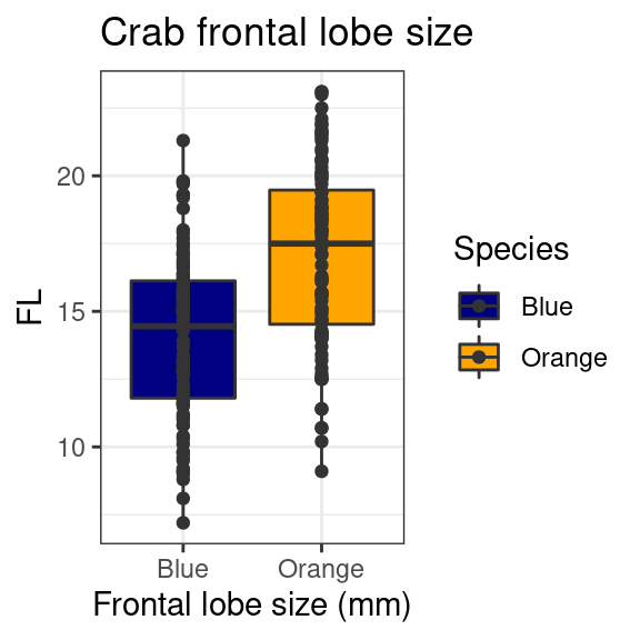
And of course, this could be faceted too:
crabs %>%
mutate(Species = recode(sp, B = "Blue", O = "Orange")) %>%
ggplot(aes(y = FL, x = Species, fill = Species)) + geom_boxplot() + geom_point(color = "grey20") +
xlab("Frontal lobe size (mm)") + ggtitle("Crab frontal lobe size") + theme_bw() +
scale_fill_manual(values = c("navy", "orange")) + facet_wrap(~sex)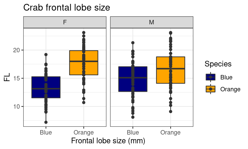 ## Other geoms There are many geom_ options you can use. Here are a
handful:
## Other geoms There are many geom_ options you can use. Here are a
handful:
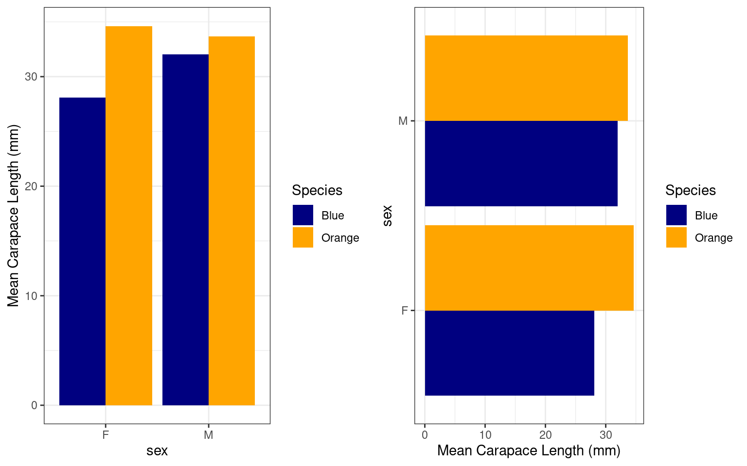
A Barplot
A barplot can be made with geom_col. There is a similar
function geom_bar() which is really a frequency
count/histogram, so be sure you don’t confuse these two. The orientation
can be flipped just by specifying x and y. In this case, we will first
aggregate mean CL by species and sex, using group_by and
summarize and save as the variable data.
data <- crabs %>%
    mutate(Species = recode(sp, B = "Blue", O = "Orange")) %>%
    group_by(sex, Species) %>%
    summarize(MeanCL = mean(CL))

print(data)
# A tibble: 4 × 3
# Groups: sex [2]
sex Species MeanCL
<fct> <fct> <dbl>
1 F Blue 28.1
2 F Orange 34.6
3 M Blue 32.0
4 M Orange 33.7We use geom_col and just fly the x and
y aesthetic arguments to rotate the graph:
grid.arrange(
data %>%  ggplot(aes(x=sex,y=MeanCL,fill=Species)) + geom_col(position="dodge")  + theme_bw() +
  scale_fill_manual(values=c("navy","orange")) + ylab("Mean Carapace Length (mm)"),


data %>%   ggplot(aes(y=sex,x=MeanCL,fill=Species)) + geom_col(position="dodge")  + theme_bw() +
  scale_fill_manual(values=c("navy","orange")) + xlab("Mean Carapace Length (mm)"), ncol=2

)
The geom_bar cannot be substituted for
geom_col, but automatically identifies counts in each
category. The crabs data set is balanced with equal numbers of sex and
species, so let’s see how many of each case have CL size less that 25 by
applying a filter:
crabs %>%
    mutate(Species = recode(sp, B = "Blue", O = "Orange")) %>%
    filter(CL < 25) %>%
    ggplot(aes(x = Species, group = sex, fill = sex)) + geom_bar(position = "dodge") +
    theme_bw() + scale_fill_manual(values = c("navy", "orange"))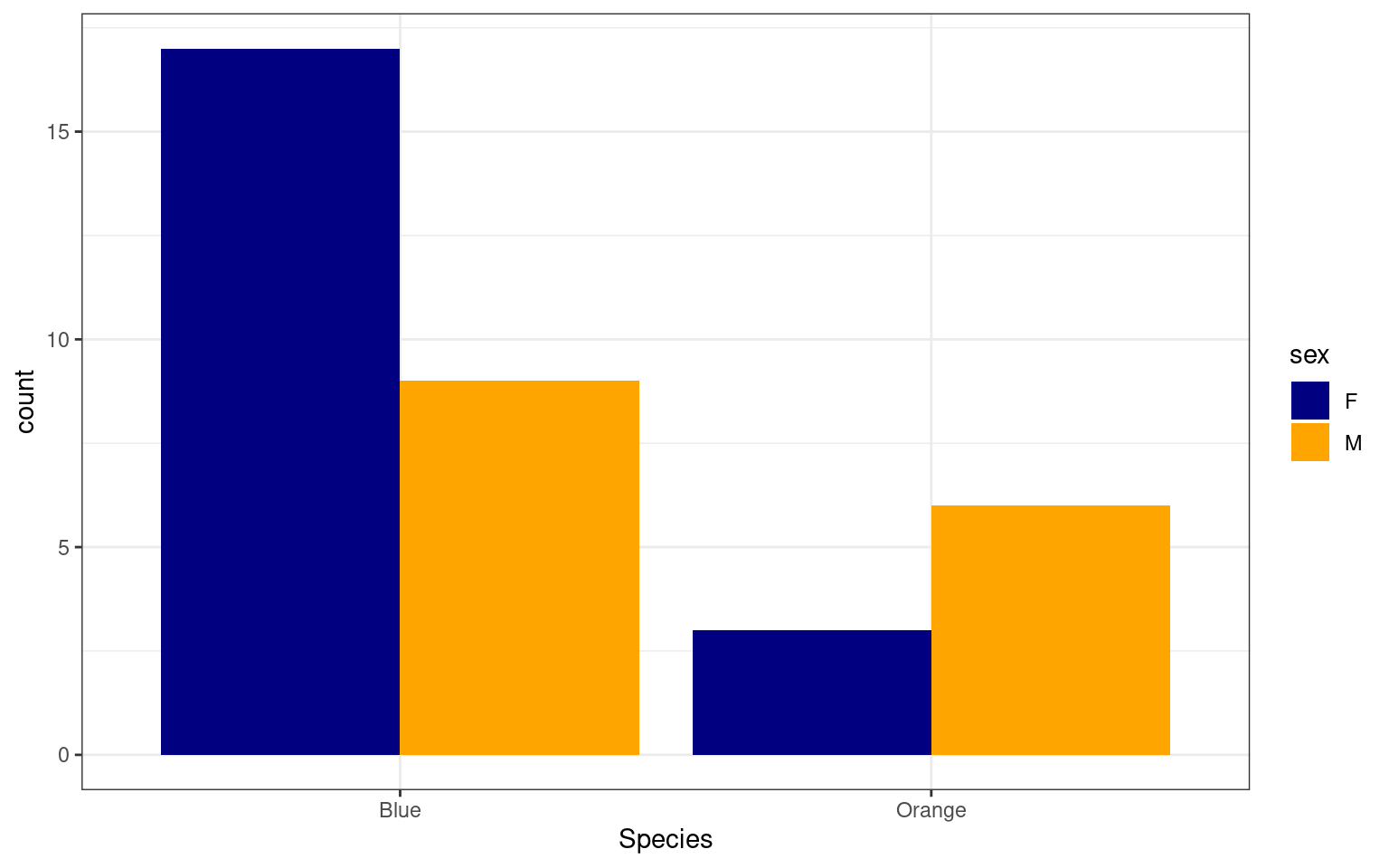
A 2D heatmap
If we want to plot a matrix as a heatmap, we previously used image() on the matrix. for example:
image(tapply(crabs$RW, list(crabs$sp, crabs$sex), mean))
But ggplot requires long data, which we would get from an aggregate or summarize. Let’s try that. Here, we after calculating the mean value, we assign that to fill (the shade of the cell), and x/y to species and sex:
crabs %>%
    mutate(Species = recode(sp, B = "Blue", O = "Orange")) %>%
    group_by(sex, Species) %>%
    summarize(MeanRW = mean(RW)) %>%
    ggplot(aes(x = sex, y = Species, fill = MeanRW)) + geom_bin_2d() + theme_bw()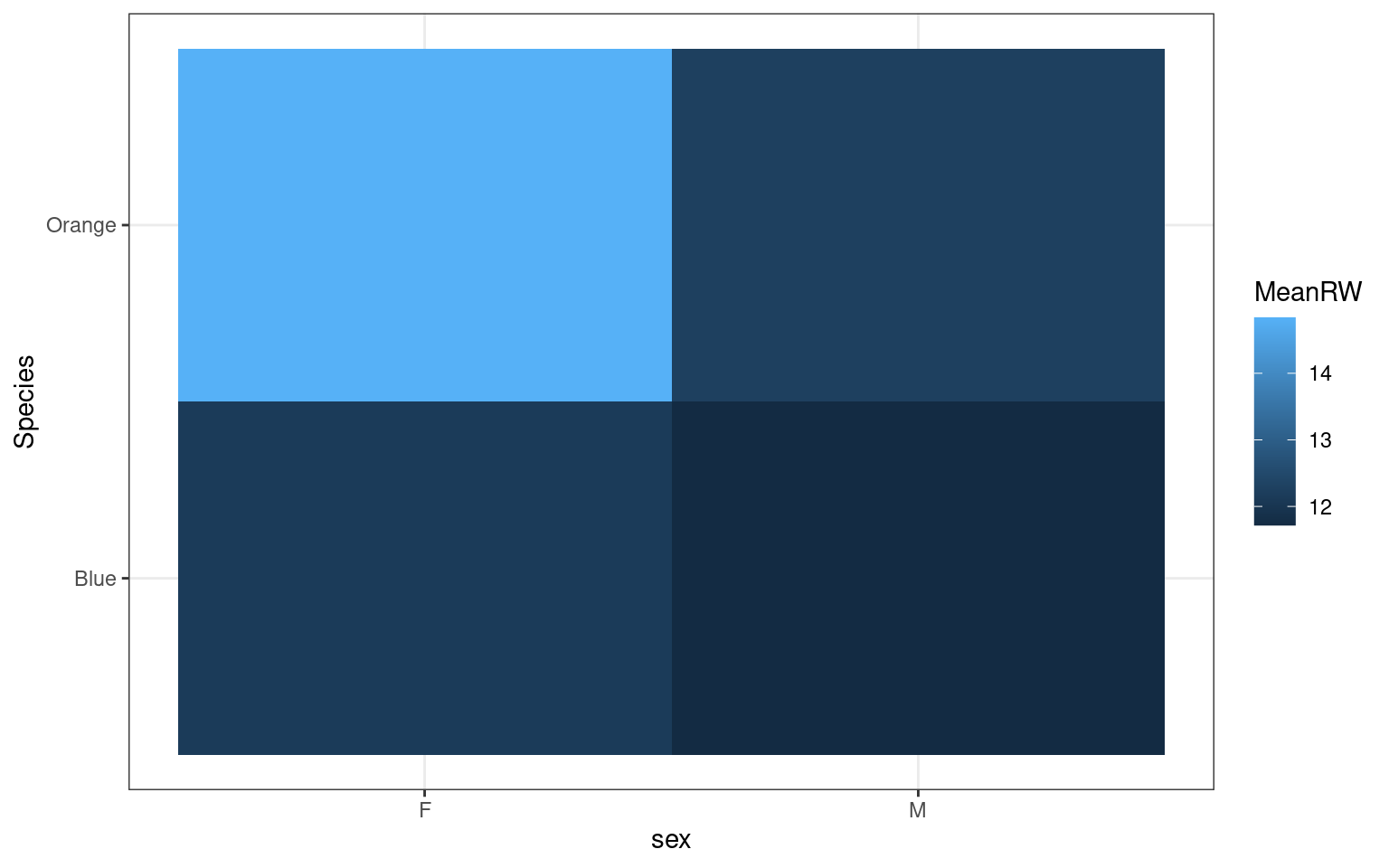
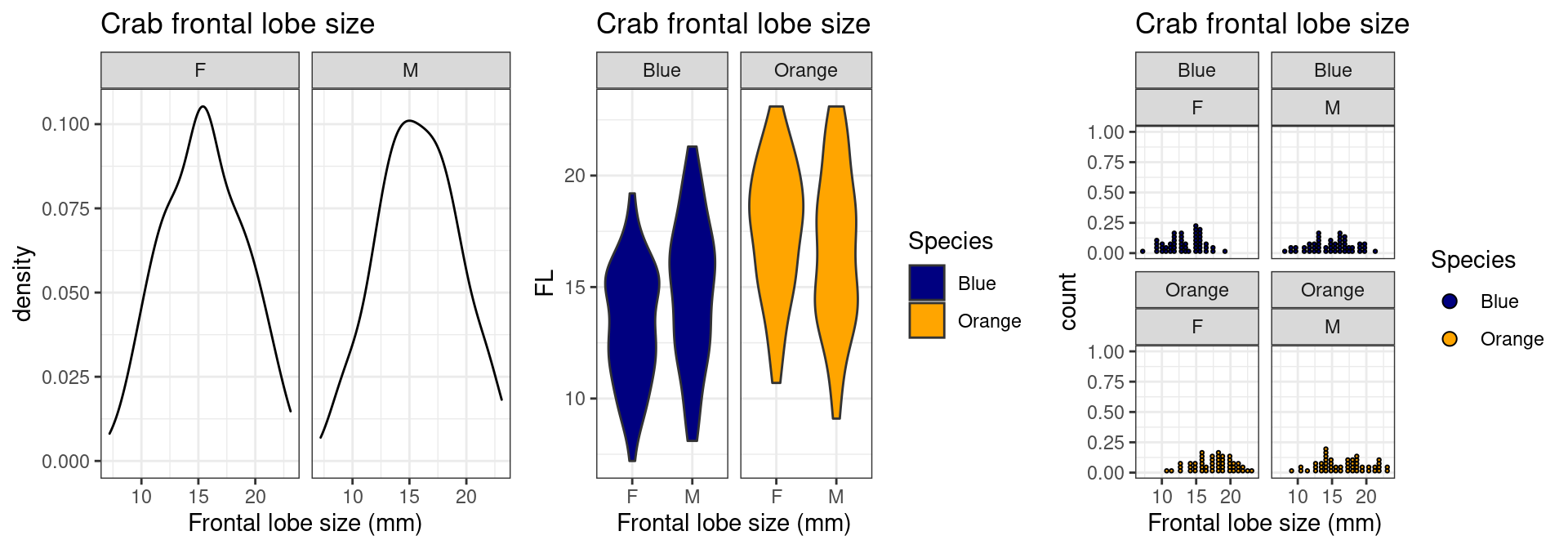
Examining a distribution with geom_density,
geom_dotplot, and geom_violin plots
We previously did boxplots and histograms, but there are a number of
other options to examine the distribution. Here I will use essentially
the same code but swap out the relevant geom_ argument.
Sometimes slightly different arguments need to be specified:
grid.arrange(
crabs %>% mutate(Species=recode(sp,"B"="Blue","O"="Orange")) %>%
ggplot(aes(x=FL)) + geom_density()+
  xlab("Frontal lobe size (mm)") +
      ggtitle("Crab frontal lobe size") + theme_bw() + scale_fill_manual(values=c("navy","orange")) +
  facet_wrap(~sex),

crabs %>% mutate(Species=recode(sp,"B"="Blue","O"="Orange")) %>%
ggplot(aes(x=sex,y=FL)) + geom_violin(aes(fill=Species))+
  xlab("Frontal lobe size (mm)") +
      ggtitle("Crab frontal lobe size") + theme_bw() + scale_fill_manual(values=c("navy","orange")) +
  facet_wrap(~Species),

crabs %>% mutate(Species=recode(sp,"B"="Blue","O"="Orange")) %>%
ggplot(aes(x=FL,fill=Species)) + geom_dotplot()+
  xlab("Frontal lobe size (mm)") +
      ggtitle("Crab frontal lobe size") + theme_bw() + scale_fill_manual(values=c("navy","orange")) +
  facet_wrap(Species~sex),ncol=3
)
Plotting with geom_text
We can add text to plots instead of using points. We will plot RW by
BD, and add a ‘rug’ which shows the points along the axes. We can adjust
xlim and ylim by adding the appropriate functions xlim()
and ylim().
tmp <- crabs %>%
    mutate(Species = recode(sp, B = "Blue", O = "Orange")) %>%
    ggplot(aes(x = RW, y = BD)) + geom_text(aes(label = paste(sex, Species), color = sex)) +
    theme_bw() + geom_rug()

grid.arrange(tmp, tmp + xlim(0, 20) + ylim(0, 25))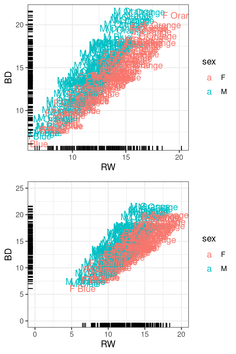
Smoothed relationships between variables
Generally we can add additional layers to existing graphs. The
geom_smooth() uses either loess or GAM smoothing models to
give a general shape of the relationship along with an error region.
There are actually a number of options, including linear regression. The
smoothing region is not well documented, so be careful interpreting what
it actually means.
tmp + geom_smooth()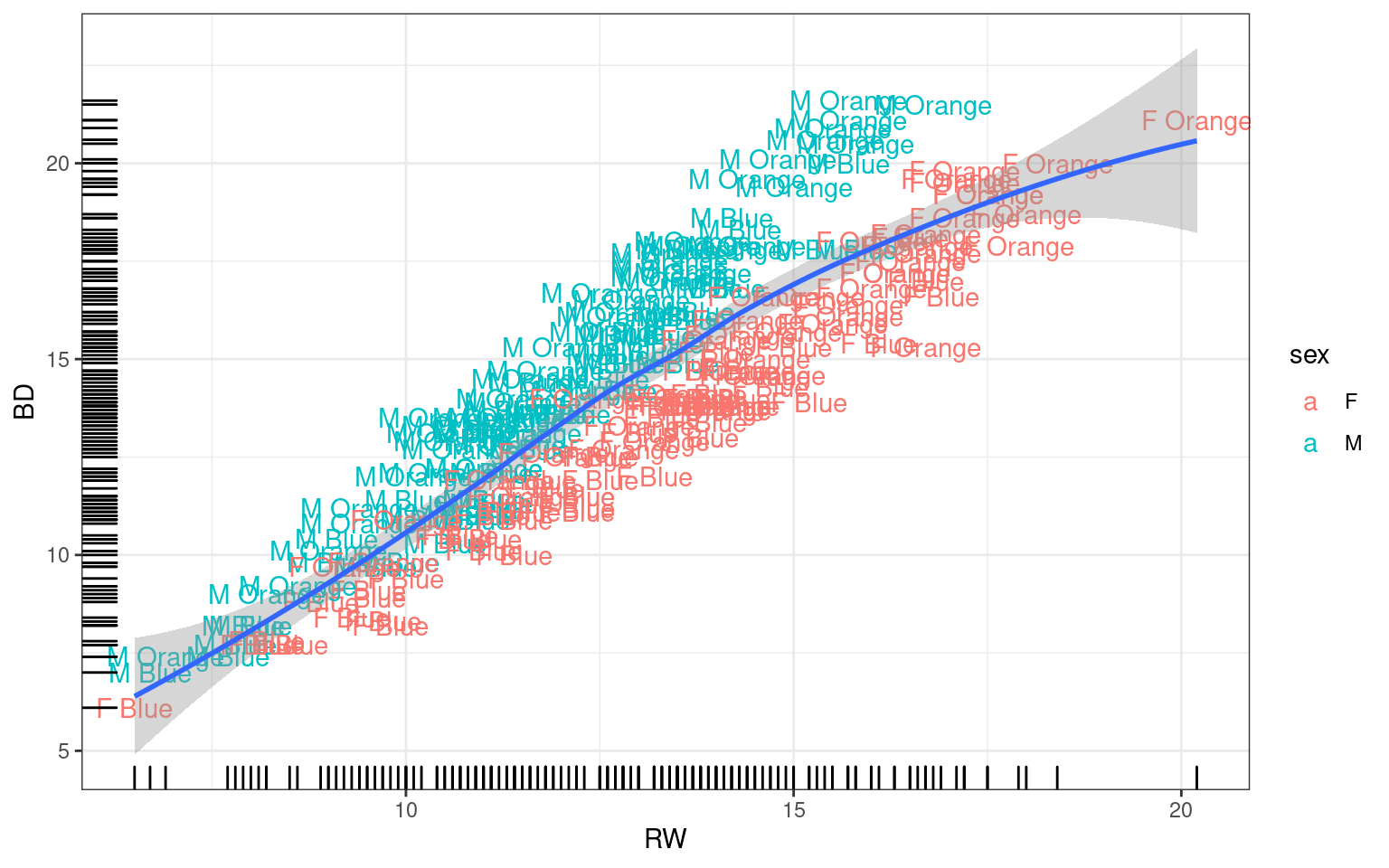
Error bars
Error bars are a bit trickier, because the correct error bar depends
on a lot of things, especially the model and inferential statistical
test being used. Thus, you cannot expect R or ggplot to know what value
you want for error bars, so we will need to calculate them yourself. We
need to first compute standard errors for our data set, which shouldn’t
be too hard. We can use summarize, but will calculate mean, sd, n and
se, min and max. We can try adding geom_errorbar
(specifying position=dodge), but it doesn’t quite work out right:
library(reshape2)


mp <- crabs %>%
    mutate(Species = recode(sp, B = "Blue", O = "Orange")) %>%
    group_by(Species, sex) %>%
    summarize(MeanFL = mean(FL), sd = sd(FL), n = n(), se = sd/sqrt(n), FLmin = MeanFL -
        se, FLmax = MeanFL + se) %>%
    mutate(Condition = paste(Species, sex))

ggplot(mp, aes(x = sex, y = MeanFL, fill = Species)) + geom_col(position = "dodge") +
    geom_errorbar(aes(fill = Species, ymin = FLmin, ymax = FLmax), position = "dodge",
        width = 0.25) + theme_bw() + scale_fill_manual(values = c("navy", "orange"))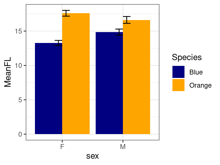
To fix this, we need to fix the dodge position using a scheme like this:
d <- position_dodge(width = 0.9)
ggplot(mp, aes(x = sex, y = MeanFL, fill = Species)) + geom_col(position = d) + geom_errorbar(aes(fill = Species,
    ymin = FLmin, ymax = FLmax), position = d, width = 0.25) + theme_bw() + scale_fill_manual(values = c("navy",
    "orange"))
Overriding or mixing data
Sometimes you want to use data from multiple data frames on the same
ggplot. For example, we can plot RW by BD as we did above, but maybe we
want an aggregated form as well, looking at mean RW by quartiles of BD.
First we will create this new aggregated data set and call it
crabsBin:
## calculate binned values using summarize:

crabsBin <- crabs %>%
    mutate(BDbin = 1 + floor(rank(BD)/200 * 3.999)) %>%
    group_by(BDbin) %>%
    summarize(FLMean = mean(FL), BDMean = mean(BD))
crabsBin
# A tibble: 4 × 3
BDbin FLMean BDMean
<dbl> <dbl> <dbl>
1 1 11.2 9.67
2 2 14.5 13.0
3 3 16.7 15.1
4 4 20.0 18.4 Here, we have the average FL value for the four quartiles of BD, as well as the mean BD for these values. We have a baseline plot of BD vs FL in tmp, and we can add a new geom_ and specify a new data argument.
tmp + geom_line(data = crabsBin, aes(x = BDMean, y = FLMean), size = 2, color = "grey25") +
    geom_point(data = crabsBin, aes(x = BDMean, y = FLMean), size = 5, shape = 16)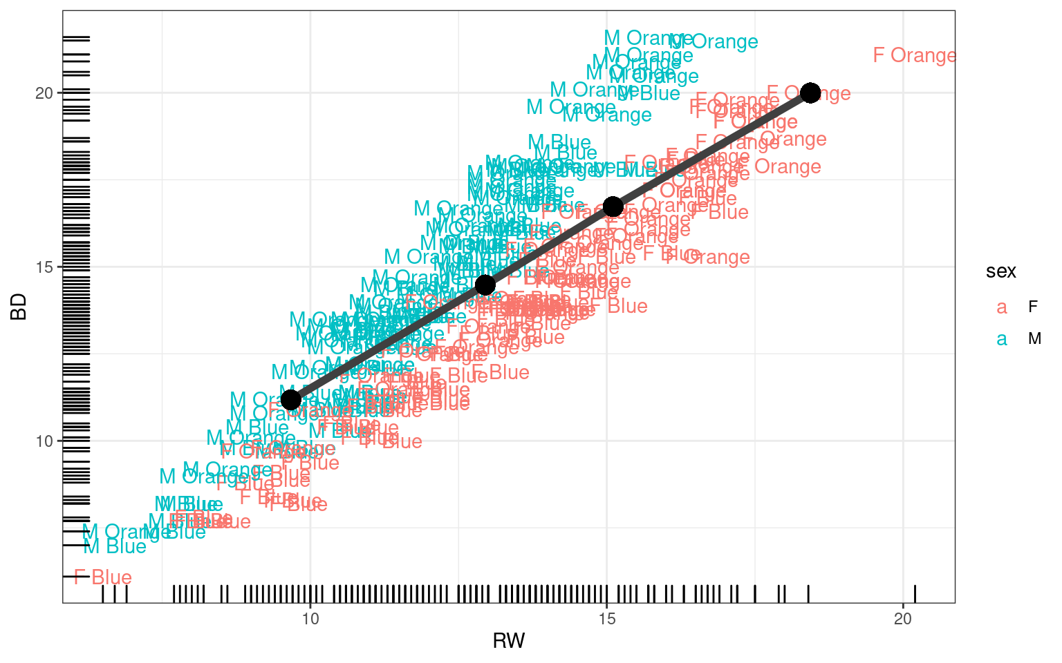
In this case, specifiyng a new data set will not override the original, so we need to set it for both the line and point geoms.
How to make a ‘matplot’ in ggplot2
In standard R, the matplot function is handy because it allows you to take a matrix of values and plot several series against each other. For example:
agg <- aggregate(dplyr::select(crabs, FL, RW, CL, CW, BD, CW), list(species = crabs$sp,
    sex = crabs$sex), mean)
matplot(dplyr::select(agg, FL, RW, CL, CW, BD), type = "b", xaxt = "n", ylab = "Size (mm)")
axis(1, 1:4, labels = paste(agg$species, agg$sex))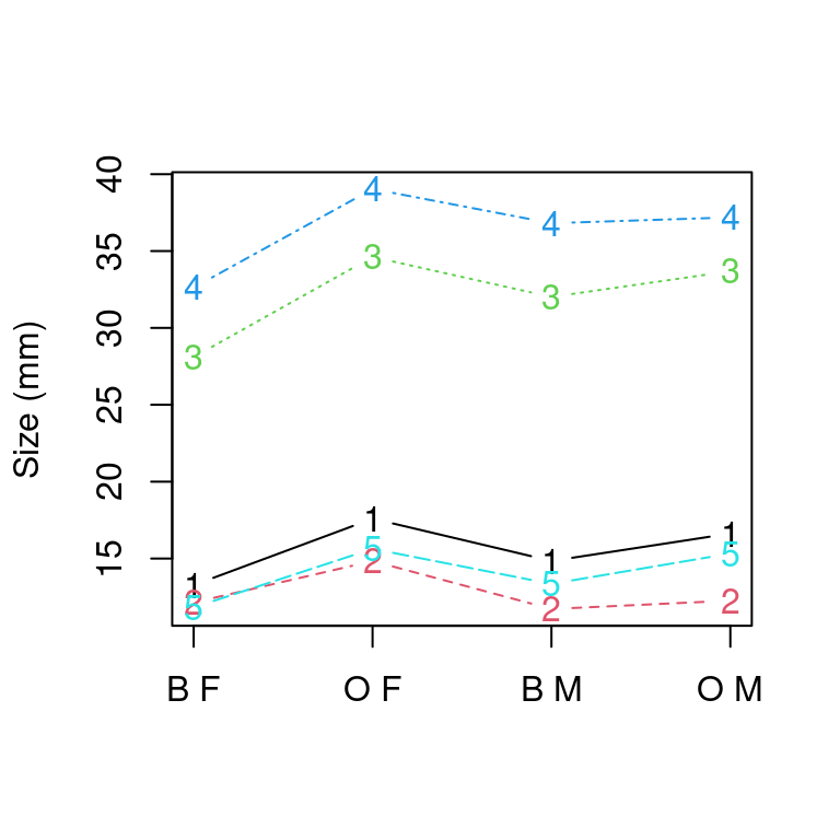
Let’s say we want to do something like this, but with ggplot. We
quickly find out that it is not easy. It doesn’t work because ggplot
expects a single variable, and you are to tell it how it needs to be
plotted. We can do one series, but not multiple. To do multiple series,
we need a long data format, using melt in reshape2 or
pivot_longer:
library(reshape2)
head(melt(agg))  ##this basically does it right!
species sex variable value
1 B F FL 13.270
2 O F FL 17.594
3 B M FL 14.842
4 O M FL 16.626
5 B F RW 12.138
6 O F RW 14.836## alternately:
agg2 <- melt(agg[, 1:6], id.vars = c("species", "sex"))
head(agg2) species sex variable value
1 B F FL 13.270
2 O F FL 17.594
3 B M FL 14.842
4 O M FL 16.626
5 B F RW 12.138
6 O F RW 14.836## or, using tidyr:
library(tidyr)
agg2 <- pivot_longer(agg, cols = c(FL:BD), names_to = "variable") %>%
mutate(aggname = paste(species, sex))
tmp <- ggplot(agg2, aes(x = aggname, y = value, group = variable, color = variable)) +
geom_line() + geom_point() + ylab("Size (mm)") + xlab("Species/Sex") + theme_bw() +
ggtitle("Variable size for species/sex of crabs")
print(tmp)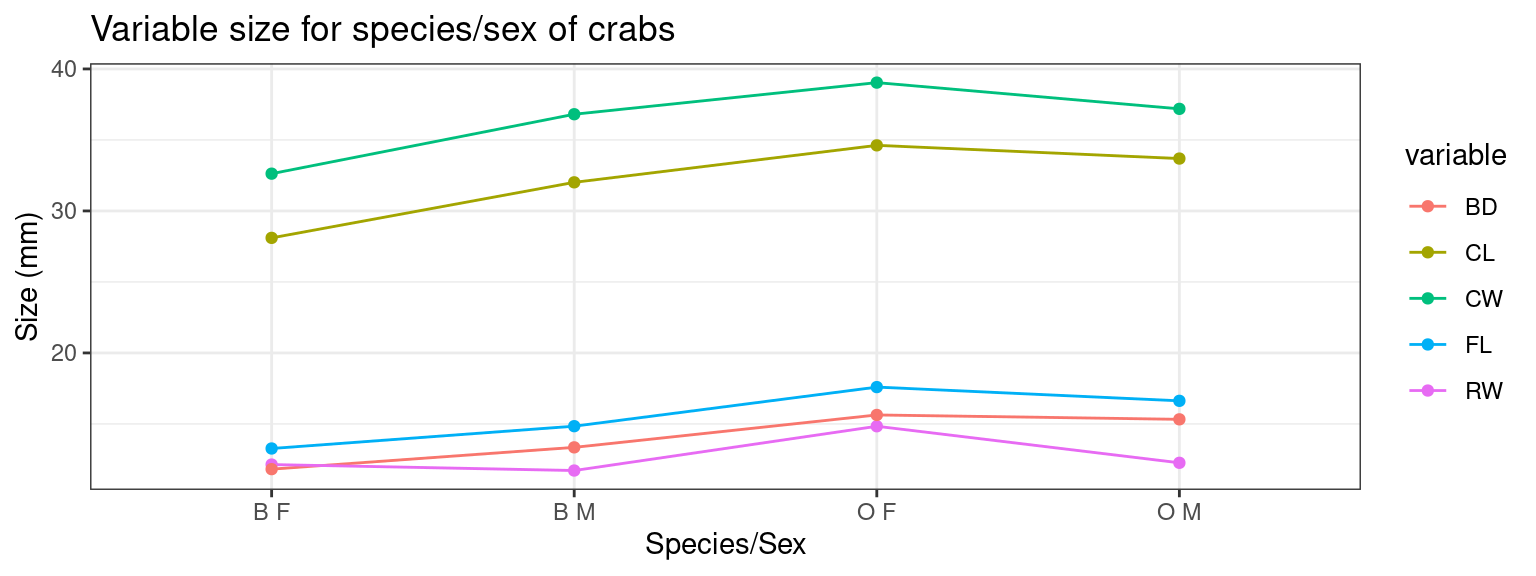
Adding other adornments
ggplot is called ‘grammar of graphics’ because it is a true grammar for composing more complex graphics. We do this by adding functions to the baseline plotting function using +. These are essentially like adding multiple arguments into the ‘geom’ argument’ but we have much more control. Note that we can save a plot as a variable, and then change the saved graphic. Sometimes, you may need to print() a saved ggplot object to get it to display.
In the previous example, suppose we want a horizontal line at y=22:
tmp + geom_abline(slope = 0, intercept = 22)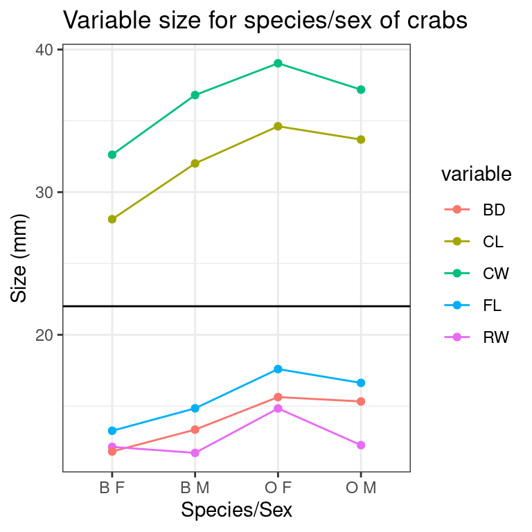
Or maybe text and some arrows and labels or text:
tmp + geom_segment(y = 24, x = 3, xend = 3, yend = 18, arrow = arrow()) + geom_segment(y = 26,
    x = 2, xend = 2, yend = 30, arrow = arrow()) + geom_label(x = 2, y = 25, label = "BIG THINGS") +
    geom_text(x = 3, y = 25, label = "small things")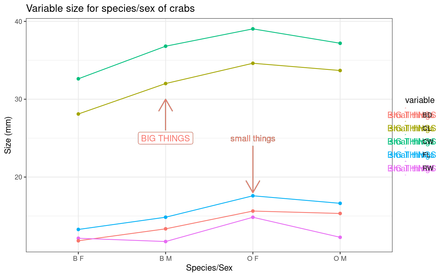
This breaks the automatic legend. To work around this, we can use an
annotate grammar function instead , specifying the geom
type in its first argument and then putting in the rest of the
arguments.
tmp2 <- tmp + annotate("segment", y = 23, x = 3, xend = 3, yend = 18, arrow = arrow()) +
    annotate("segment", y = 27, x = 2, xend = 2, yend = 30, arrow = arrow()) + annotate("label",
    x = 2, y = 26, label = "BIG THINGS") + annotate("text", x = 3, y = 24, label = "small things")
tmp2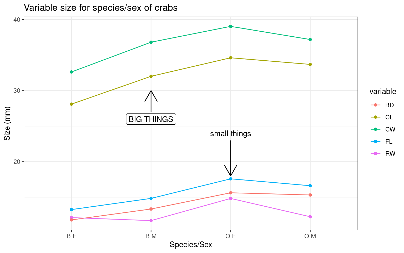
The group argument in aes binds a series together for the particular graph. The first graph we made is completely strange, and the second doesn’t make the lines we ask for because of it. If things are not working out in your ggplot, be sure you have group specified, and also look out that you have done the right level of aggregation/summarizing.
Themes
Changing themes is done by adding various theme_() functions. But it is difficult to get the same level of control you can get with base R graphics. If you are producing a figure for publication, black/white or greyscale is usually preferred. Just add a theme_bw() to the end and you can get this:
# standard theme
myplot <- tmp2
a <- myplot + theme_grey()
## black and white theme:
b <- myplot + theme_bw()
c <- myplot + theme_dark() + theme(plot.title = element_text(size = rel(0.5), colour = "blue"))
d <- myplot + theme_minimal()
grid.arrange(a, b, c, d, ncol = 2)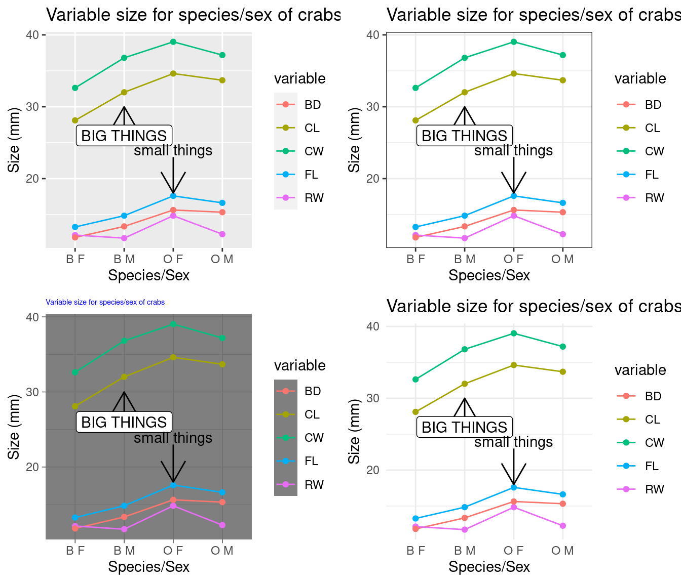 There is a package ggthemes() that hase a lot of popular color/graphic
themes, including themes that make your graphics look like excel,
fivethirtyeight.com, the economist, stata, and many other built-in and
customizeable options. the theme_X() changes the background color
scheme, and scale_color_* and scale_shape_* change the graphical
objects
There is a package ggthemes() that hase a lot of popular color/graphic
themes, including themes that make your graphics look like excel,
fivethirtyeight.com, the economist, stata, and many other built-in and
customizeable options. the theme_X() changes the background color
scheme, and scale_color_* and scale_shape_* change the graphical
objects
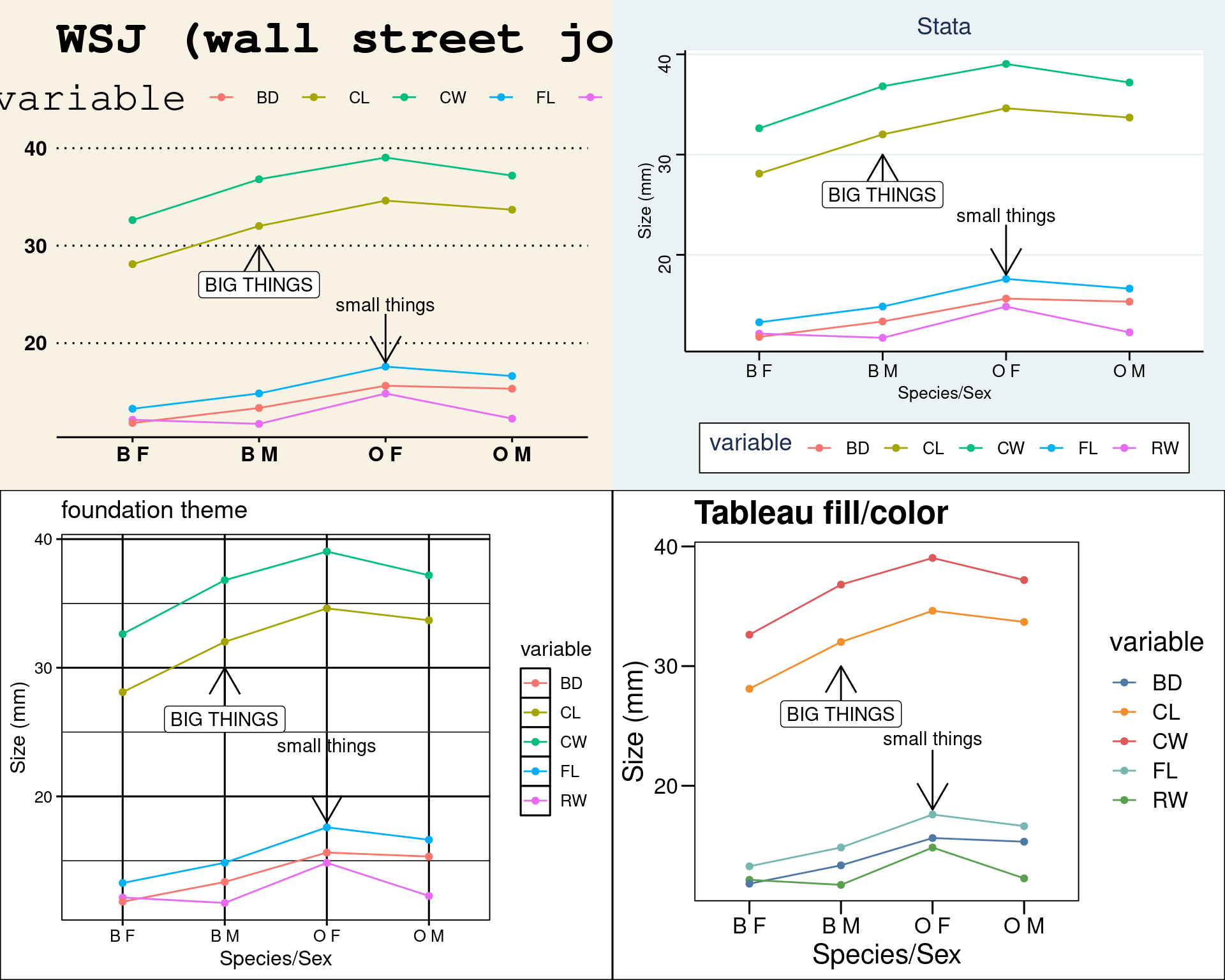
library(ggthemes)
grid.arrange(myplot + theme_excel() + scale_color_excel() + scale_fill_excel(), myplot +
    theme_fivethirtyeight() + scale_color_fivethirtyeight() + scale_shape_tremmel(),
    myplot + theme_economist_white() + scale_shape_cleveland(), myplot + theme_clean())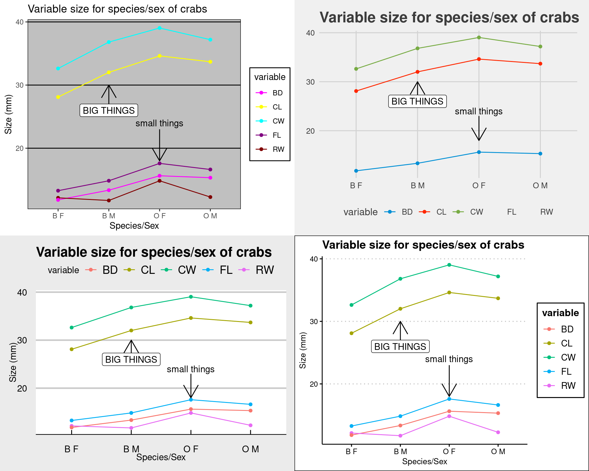
ggthemes contains many themes, palettes, and scale_ functions. Using a scale_ function uses a particular set of shapes, colors, or fill schemes, so you can mix and match. Here are some more:
grid.arrange(
myplot + theme_wsj()  + ggtitle("WSJ (wall street journal)"),
myplot + theme_stata()  + ggtitle("Stata"),
myplot + theme_foundation()  + ggtitle("foundation theme"),
myplot + theme_base() + scale_fill_tableau() + scale_color_tableau() + ggtitle("Tableau fill/color")


)
Saving
You can save graphics just like you always do, but the
ggsave() functions offers a method for saving the latest
graphic you created.
myplot + geom_point(size = 4, alpha = 0.45, color = "red") + geom_line(col = "darkblue") +
    ggtitle("Crab measurements")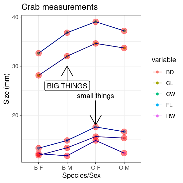
Save image files using ggsave:
ggsave(filename = "demo.png", dpi = 600, width = 8, height = 4)
ggsave(filename = "demo.pdf", dpi = 600, width = 8, height = 4)
ggsave(filename = "demo.eps", dpi = 600, width = 8, height = 4)
ggsave saves based on the file extension, and currently can save as ps, tex (pictex), pdf, tiff, png, bmp and wmf (windows only).
Other features
The breadth of things you can do with ggplot is truly amazing. The default themes are nice, but you can change these fairly easily if you dig into examples provided in many places.
Reporting
The default settings of ggplot2 are best for on-screen graphics. Some journals prefer black-and-white. Alternate themes are available that will still produce attractive black-and-white images.
Most journals will be a bit picky about the graphic format of images. Many will want .tiff format, which is a compressed graphic format that is lossless. .png works this way as well, but you are best off sticking with something they know and understand.
During pdf creation, a journal sometimes compresses image-based graphics and they can be lossy. With standard R graphics, you can save as a .ps format (rename to .eps), and most will be able to handle this as well. However, ggplot renders graphics to a rasterized image, and so overall you images will probably be larger and there could be quality issues if you don’t use a high enough dpi or image size.
Minimal example with ggvis
library(ggvis)
mtcars %>%
    ggvis(~wt, ~mpg) %>%
layer_points()Exercises and challenges
Here are some things that appear like they should be easy to accomplish, but may not be.
Smoothing envelope
Using geom_smooth() is a popular visualization that creates a loess regression, and also displays some sort of estimate of standard error or quantiles. Plot a smoothed line and the individual points for the relationship between HDI and CPI in the EconomostData.csv file.
library(readr)
ec <- read.csv("EconomistData.csv")
Bar plots
- Make a histogram of the CPI values
- Make a bar plot/histogram of the of the number of countries in each region
- Make a bar plot showing average CPI per region
- Make a xy plot showing the relationship between CPI and HDI for separate colored series for each region
- Add a geom_smooth to that.
- Use faceting instead for each line.
plotting raw data
Plot the following series in ggplot. * First, plot outcome alone, so yo ucan see the 100 values in sequence. * Then, plot both outcome and outcome2, so you can see separate sequences, using a single data frame. * Do the same thing, but with different data arguments for each line so that you use two separate data frames.
outcome <- rnorm(100) + 1:100

outcome2 <- runif(100) + 100:1
Group means
- For the crabs data, make a bar plot (not a boxplot) showing mean FL by sex and species.
Layers
Compute bin averages for outcome as follows:
binmeans <- aggregate(outcome, list(rep(1:10, each = 10)), mean)Add the mean of each bin to your outcome plot at an appropriate location (i.e., 5,15,25,…,95)
Adding text
- Add text labels to the xy plot of HDI vs. CPI
- Use ggrepel to add text instead of the normal way, using both
geom_text_repelandgeom_label_repel.
base <- ggplot(data = ec, aes(x = HDI, y = CPI))Assumptions and Limitations
ggplot is fairly flexible, and can produce beautiful graphics, but it can be a little frustrating to use when you are used to the layering and drawing of traditional R graphics. Many additional libraries aim to make ggplot more flexible, produce custom plots, or give alternative (easier) syntax to access the plots.