Introductory R Tutorial 3: Filtering and Plotting
Shane T. Mueller shanem@mtu.edu
Michigan Technological University
Shane T. Mueller shanem@mtu.edu
Michigan Technological University
Return to main site | Lesson 1 | Lesson 2 | Lesson 3 | Lesson 4 | Lesson 5
Download Lesson 3 files here
You can share annotations, questions, and answers on any of these pages using hypothes.is. Use this link to join the group
The goals of this session are to introduce you to data handling and visualization. We will start by looking a plotting, which you are now ready to learn because you have understood data types and functions.
The main topics covered will include:
The data file physio.csv was collected from a system that records heart rate, breathing rate, and skin temperature and writes this to a file every 15 seconds. We will look at just the first few rows of the data here, using the head() function:
##        date time  HR BR tempC position   ambulation Alert  PWI
## 1 6/11/2018    0  98 21  29.6     Side   Stationary  Blue Blue
## 2 6/11/2018   15 128 21  28.4  Unknown MovingSlowly  Blue Blue
## 3 6/11/2018   30 178 22  30.1   Supine MovingSlowly  Blue Blue
## 4 6/11/2018   45 179 27  32.2  Unknown   MovingFast  Blue Blue
## 5 6/11/2018   60 184 32  32.4  Unknown MovingSlowly  Blue Blue
## 6 6/11/2018   75 170 36  32.3  Upright   Stationary  Blue Blue
It actually recorded a number of other columns, but I have deleted these to make them easier to manage. Along with a time counter in seconds, it records a body position and a classification of whether the participant was moving or not (in this data, they wer always Stationary). It also provides some categories for whether the person has high physio measures which could be of a concern, but because this was always stationary, that is not a problem.
We already know how to select a specific variable using the $ operator. For example, we can look at the temperature:
##   [1] 29.6 28.4 30.1 32.2 32.4 32.3 32.4 32.5 33.6 32.6 32.6 32.6 32.7 32.7 32.7 32.8 32.8 32.8 32.8 32.8 32.9 32.9 31.0
##  [24] 31.1 29.9 30.5 30.4 33.1 33.1 33.1 33.1 33.2 33.2 33.2 33.2 33.3 33.2 33.3 33.4 33.4 33.4 33.5 33.5 33.6 33.6 33.6
##  [47] 33.6 33.6 33.7 33.7 33.7 33.7 33.8 33.8 33.9 33.9 33.9 33.9 33.9 33.9 33.9 36.4 36.5 34.1 34.1 34.1 34.1 34.2 34.1
##  [70] 34.2 34.2 34.2 34.2 34.3 34.3 34.3 34.3 34.4 34.4 34.4 34.4 34.4 34.4 34.4 34.4 34.5 34.5 34.5 34.5 34.5 34.6 34.6
##  [93] 34.6 34.6 34.6 34.6 34.6 34.6 34.7 34.7 34.7 34.7 34.7 34.7 34.8 34.7 34.7 34.7 34.8 34.8 34.8 34.8 34.8 34.8 34.8
## [116] 34.9 34.9 34.9 34.9 35.0 35.0 35.0 35.0 35.0 35.0 35.0 35.0 35.0 35.0 35.0 35.0 35.1 35.1 35.1 35.1 34.2 35.1 35.2
## [139] 35.2 35.2 35.2 35.2 35.2 35.2 35.3 35.3 35.3 35.3 35.3 35.3 35.3 34.4 32.9 32.6 32.3 32.0 31.7 31.5 31.4 31.4 31.3
## [162] 31.3 31.2 31.2 31.0 31.0 30.9 30.9 30.0
However, it is hard to see if there is a pattern here.
plot() functionWe can use the plot() function to make a simple plot. Notice the arguments for the code block to fix the size of the figure.
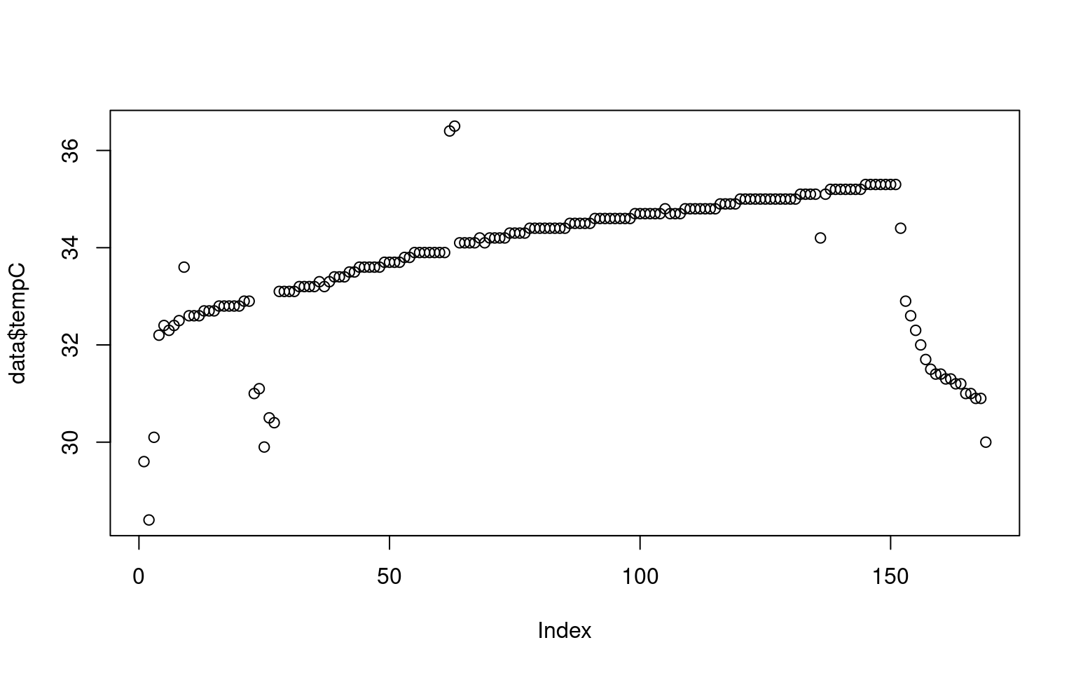
What we didn’t probably see in the numbers that after a sharp rise, the skin temperature slowly increases throughout the session, and then fell sharply. There are also some nosy data, and an area around sample 25 where maybe the sensor was removed or adjusted for a minute. But how long is the session? Maybe if we plot by time, that would be easier. We can give the plot function two arguments, and it makes an x/y plot. We will divide time by 60 to give it as time in minutes, so it is easier to comprehend.
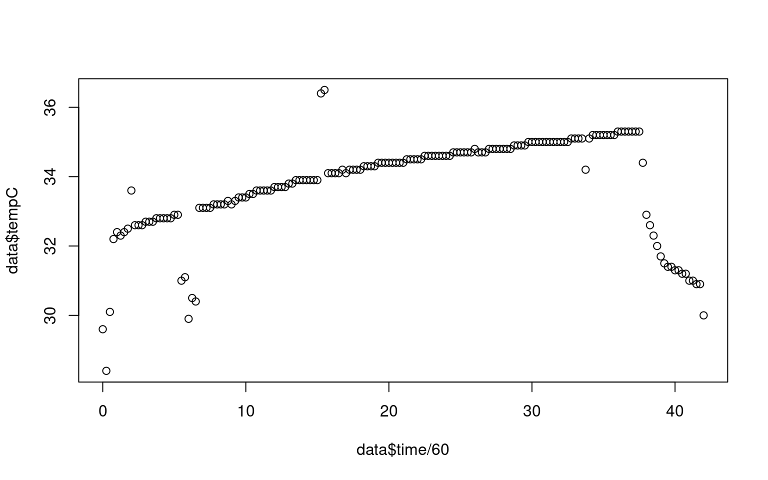 Ok, we can see that this occurred over a 35-minute session. But the plot looks ugly. It has no title, no readable axis labels, and it plots in black open circles.
Look up the the plot and the par functions in the help, and create a new plot that includes axis labels, a main label, changes this to a line plot or a line + symbol plot, changes the symbol being plotted, and changes the color being plotted.
Our initial plot of the data looks fine, but there are some obvious problems: it appears to include data at the beginning and the end which is bad–probably the sensor had not yet been put on, and then it was taken off before we stopped collecting data. Also, there are some points that look like blips; probably sensor errors or something we might want to clean up.
We’d like to restrict the data to just the values we think are valid, How might we do that? Here are some ideas, and we might have to do all of them.
Try to select a range of rows from the middle, cutting out the ends.
Count the time periods/indexes of the bad data, and figure out a way to remove them. This is a bit tedious, and would not help us a lot if we needed to handle dozens of these data sets, but it is likely to work, as long as we don’t make mistakes. But we are likely to make mistakes.
Figure out a valid range of temperatures, and throw out any data outside that range–maybe 32 to 35. This will work for the initial data and some of the noisy data, but not for all the data points, which are noisy but within the range.
Come up with a rule for detecting outliers, like if the change between two data points is large, and filter these out. This might work for the pops, but maybe not for the smooth decline at the end.
We will try a few different approaches to explore filtering options.
The first option is to simply figure out the middle range and use that. Just like we used the [] to select a single row or column of a matrix, we can select a range. We might guess that we want to keep rows 4 through 150. We can put the sequence of rows, and then a comma, indicating we want to keep all the columns, but only access a subset of rows. Here, I create a new data frame by selecting the rows using this method.
data2 <- data[4:150,]


par(las=1)  ##This turns the temperature numbers horizontal
plot(data2$time/60,data2$tempC,
     xlab="Time (m)",ylab="Temperature (c)",
    main="Skin temperature over time: Filtering out the ends",
    pch=16,       type="o",
    col="navy",    bty="L",       lwd=2,         cex=.75)
grid()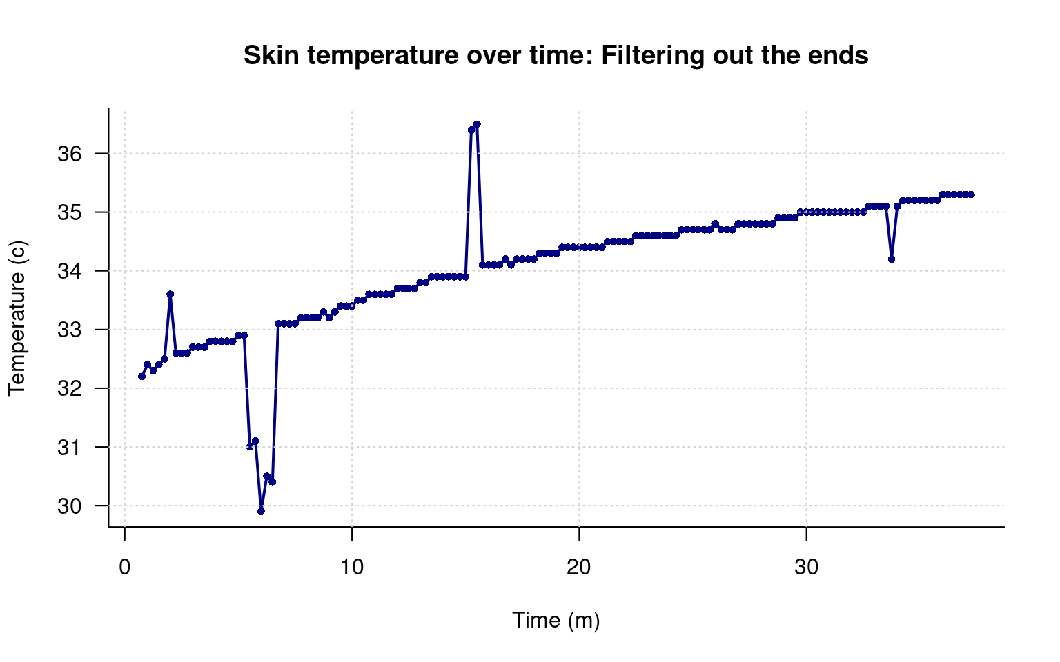
That looks a lot better, but I’m not going to be able to get rid of the pops that easily. To to that, I can count the indexes I want to remove. To make it easier, I will first create a list of the indexes to remove, and then use another filter method to make a logical vector of 169 T/F values, so we can filter out, or plot things differently, and apply the same filter to all of the data variables in the data frame.
First, I will record the rows that are bad in a vector. Then I will make a vector of boolean values that are all TRUE. Next, I need to do something we haven’t done before which can look like black magic to new users. I will select rows on the left side of the assignment operator, and assign F to those values. If I plot this vector, we can see it jumps between 0/1 or F/T, with a few F and mostly T values.
badrows <- c(1:3,9, 23:28,44,62,63,137,150:169)
keep<- rep(T,169)
keep[badrows] <- FALSE
plot(keep,type="s",xlab="Data row",ylab="Value of keep",yaxt="n",bty="L")
axis(2,c(0,1),c("FALSE","TRUE"))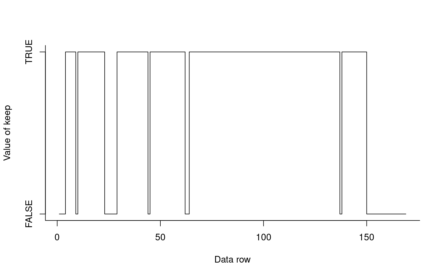
par(las=1)  ##This turns the temperature numbers horizontal
plot(data2$time/60,data2$tempC,
     xlab="Time (m)",ylab="Temperature (c)",
    main="Skin temperature over time: Filtering by hand",
    pch=16,       type="o",
    col="navy",    bty="L",       lwd=2,         cex=.75)
grid()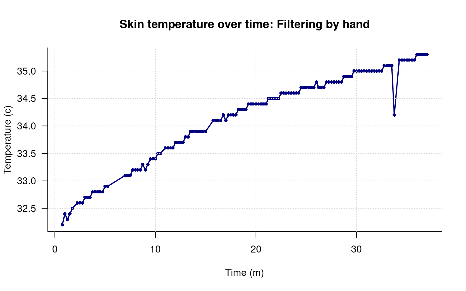
Here, we seemed to catch the right values. If you look carefully, you will see that the line gets connected seamlessly over the missing data, because we have simply edited it out. But I also made at least one mistake: I missed a bad data point near the end. Did I miscode any others and remove them incorrectly? Clearly, I might not know unless I check.
To do this, lets think about filtering differently. What if we plotted every value, but changed the color of ones we remove? To do this, we need a vector of color names–one for each of the data rows. To do this, we will use the filter we just made, which is a bunch of TRUE/FALSE values. We would like a bunch of ‘navy’ and red values maybe, which we can put in a new vector, and use the [] to select from that. But here we will use another trick–we can specify the same row multiple times when we use the selection. Let’s say we wanted 5 “navy”, 4 “red”, and 3 “navy” in a row. We can do that like this:
## [1] "navy" "navy" "navy" "navy" "navy" "red" "red" "red" "red" "navy" "navy" "navy"Now it is just a matter of turning the T/F filter vector into 1/2 values. Remember that F=0 and T=1, so we can just add 1 to the filter and get what we want. However, we will need to reverse the colors vector.
##   [1] "red"  "red"  "red"  "navy" "navy" "navy" "navy" "navy" "red"  "navy" "navy" "navy" "navy" "navy" "navy" "navy"
##  [17] "navy" "navy" "navy" "navy" "navy" "navy" "red"  "red"  "red"  "red"  "red"  "red"  "navy" "navy" "navy" "navy"
##  [33] "navy" "navy" "navy" "navy" "navy" "navy" "navy" "navy" "navy" "navy" "navy" "red"  "navy" "navy" "navy" "navy"
##  [49] "navy" "navy" "navy" "navy" "navy" "navy" "navy" "navy" "navy" "navy" "navy" "navy" "navy" "red"  "red"  "navy"
##  [65] "navy" "navy" "navy" "navy" "navy" "navy" "navy" "navy" "navy" "navy" "navy" "navy" "navy" "navy" "navy" "navy"
##  [81] "navy" "navy" "navy" "navy" "navy" "navy" "navy" "navy" "navy" "navy" "navy" "navy" "navy" "navy" "navy" "navy"
##  [97] "navy" "navy" "navy" "navy" "navy" "navy" "navy" "navy" "navy" "navy" "navy" "navy" "navy" "navy" "navy" "navy"
## [113] "navy" "navy" "navy" "navy" "navy" "navy" "navy" "navy" "navy" "navy" "navy" "navy" "navy" "navy" "navy" "navy"
## [129] "navy" "navy" "navy" "navy" "navy" "navy" "navy" "navy" "red"  "navy" "navy" "navy" "navy" "navy" "navy" "navy"
## [145] "navy" "navy" "navy" "navy" "navy" "red"  "red"  "red"  "red"  "red"  "red"  "red"  "red"  "red"  "red"  "red"
## [161] "red"  "red"  "red"  "red"  "red"  "red"  "red"  "red"  "red"
Now, we can give the function this vector in the color argument, instead of a single value of ‘navy’.
par(las=1) ##This turns the temperature numbers horizontal
plot(data$time/60,data$tempC,
xlab="Time (m)",ylab="Temperature (c)",
main="Skin temperature over time: Filtering by hand",
pch=16, type="o",
col=colorvec, bty="L", lwd=2, cex=.75)
grid()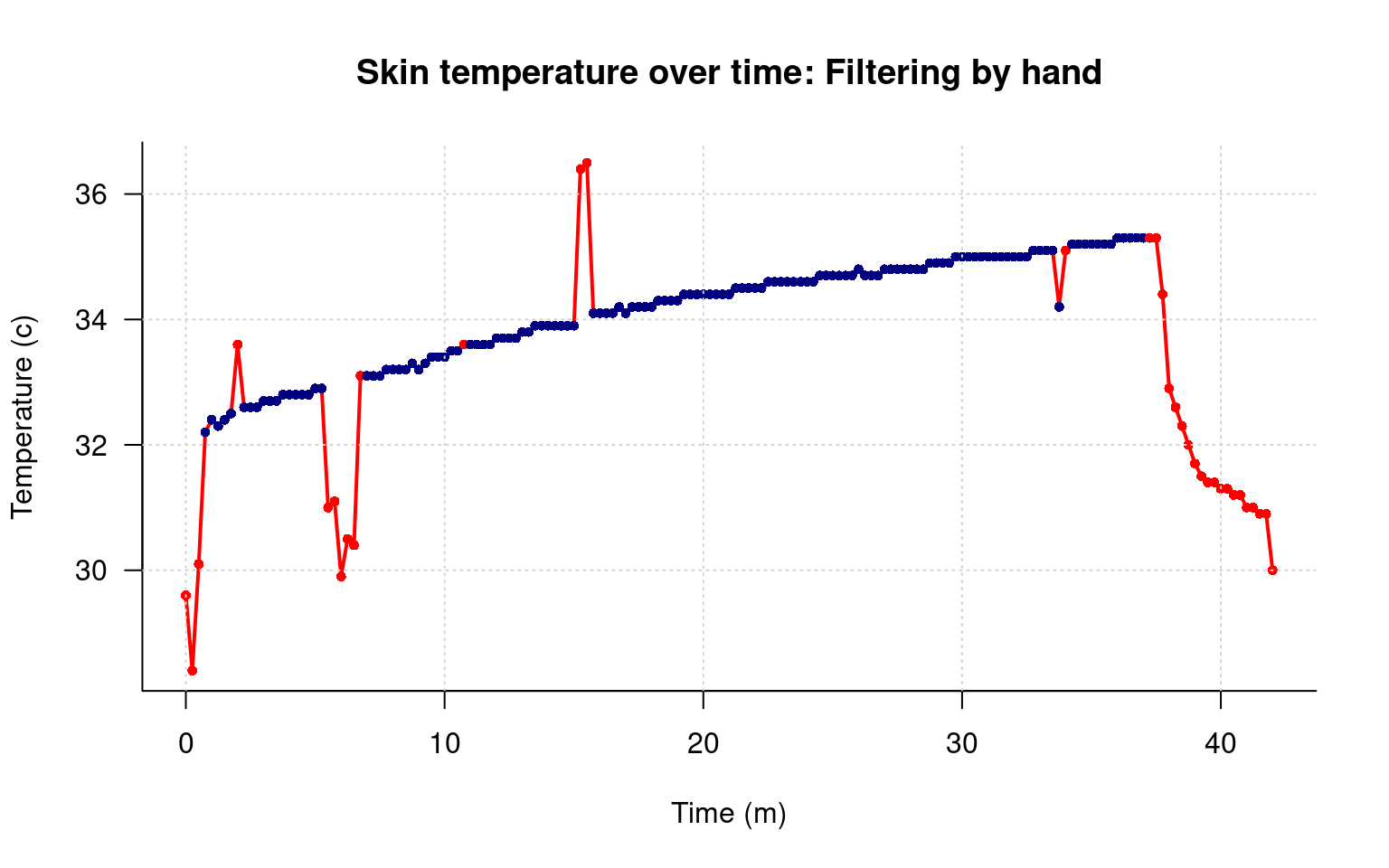 That looks pretty good, and it shows the values we removed, and at least a few we removed incorrectly, and the one we didn’t remove. However, there is something about the line that I don’t like. What I’d like is to have the smooth line we used before, but to plot the red/blue points as well.
To do this, we will use one of the nice features of R plotting–overlaying. Overlaying lets you build a plot layer by layer. This is exactly how we made the grid on top of the function. The points() function works just like the plot() function, but it does not plot axis or axis labels, and plots on top of the plot we previously made. Our strategy here will be to make the plot we just made with plot, but without the lines. Then we will add lines connecting the data we did no not want to throw out. Although the filter is wrong, we will keep using that same filter for now. Instead of making a new filtered data set, we will just filter it directly in the points command. I will also use the [keep+1] filter trick for point size and symbol.
par(las=1)  ##This turns the temperature numbers horizontal
plot(data$time/60,data$tempC,
     xlab="Time (m)",ylab="Temperature (c)",
    main="Skin temperature over time: Filtering by hand",
    pch=c(5,16)[keep+1],       type="p",
    col=c("red","navy")[keep+1],    bty="L",
    cex=c(1,.5)[keep+1]   )

grid()
points(data[keep,]$time/60,data[keep,]$tempC,type="l",lwd=1.5,col="grey")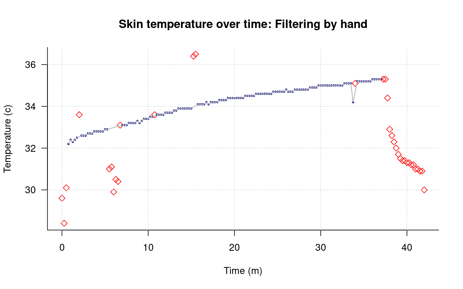
This helps me see both the main pattern of data, and the filtered points clearly.
Finally, maybe we want an automatic outlier detection instead of the one by hand. We could maybe combine that with a hand-coded start/end filter. An easy filter is to look at the change between any pair of points. To do this, we can subtract each data point from the previous row, and take the absolute value. We can remove a single row with the [] by referring to the index with a negative value, which we need to do to accomplish this. That will be one row too short, so we will add a single T at the beginning. Maybe we will try to remove any points that change by .2 or more. I will reverse the remove vector by using the negative operator !, and combine several filters with the & operator. We will look at any value that differs from the one before AND the one after by .2 or more, and remove it.
remove.for <- c(abs( data$tempC[-1]-data$tempC[-nrow(data)]) >.2,T)
remove.back <- c(T,abs(data$tempC[-nrow(data)]- data$tempC[-1]) >.2)
remove.ends <- rep(F,nrow(data))
remove.ends[1:3] <- T
remove.ends[155:169] <- T


keep <-  ! ((remove.for & remove.back) | remove.ends)

keepTemp <- data$tempC < 36 & data$tempC > 32

keep <- keep & keepTemp


par(las=1)  ##This turns the temperature numbers horizontal
plot(data$time/60,data$tempC,
     xlab="Time (m)",ylab="Temperature (c)",
    main="Skin temperature over time: Using multiple filters",
    pch=c(5,16)[keep+1],       type="p",
    col=c("red","navy")[keep+1],    bty="L",
    cex=c(1,.5)[keep+1]   )

grid()
points(data[keep,]$time/60,data[keep,]$tempC,type="l",lwd=.5,col="grey")
This removes most of the bad data, but not the regions around minute 7 and 15. How might we handle those?
The samples near minute 7 are all less than 31.5, which is 88.7 F; clearly too low for valid data. Similarly, near minute 15, there are two measures above 36, which is higher than all of our data by a large amount. Create another filter based on normal temperature range of 31.5 to 36, and use that to remove any outlying data points.
We’d like to plot the heart rate and breathing rate data as well. Luckily, although these are different measures, they all fall into a similar range, so we can plot them all on one figure. The matplot function is helpful for doing this–it plots several series of data as distinct lines. But we need to select the columns we want first. We can use the [] operator, and maybe just select the columns we want, which would be data[,3:5], but it might be more foolproof to select by the name of the variables. We can do that too:
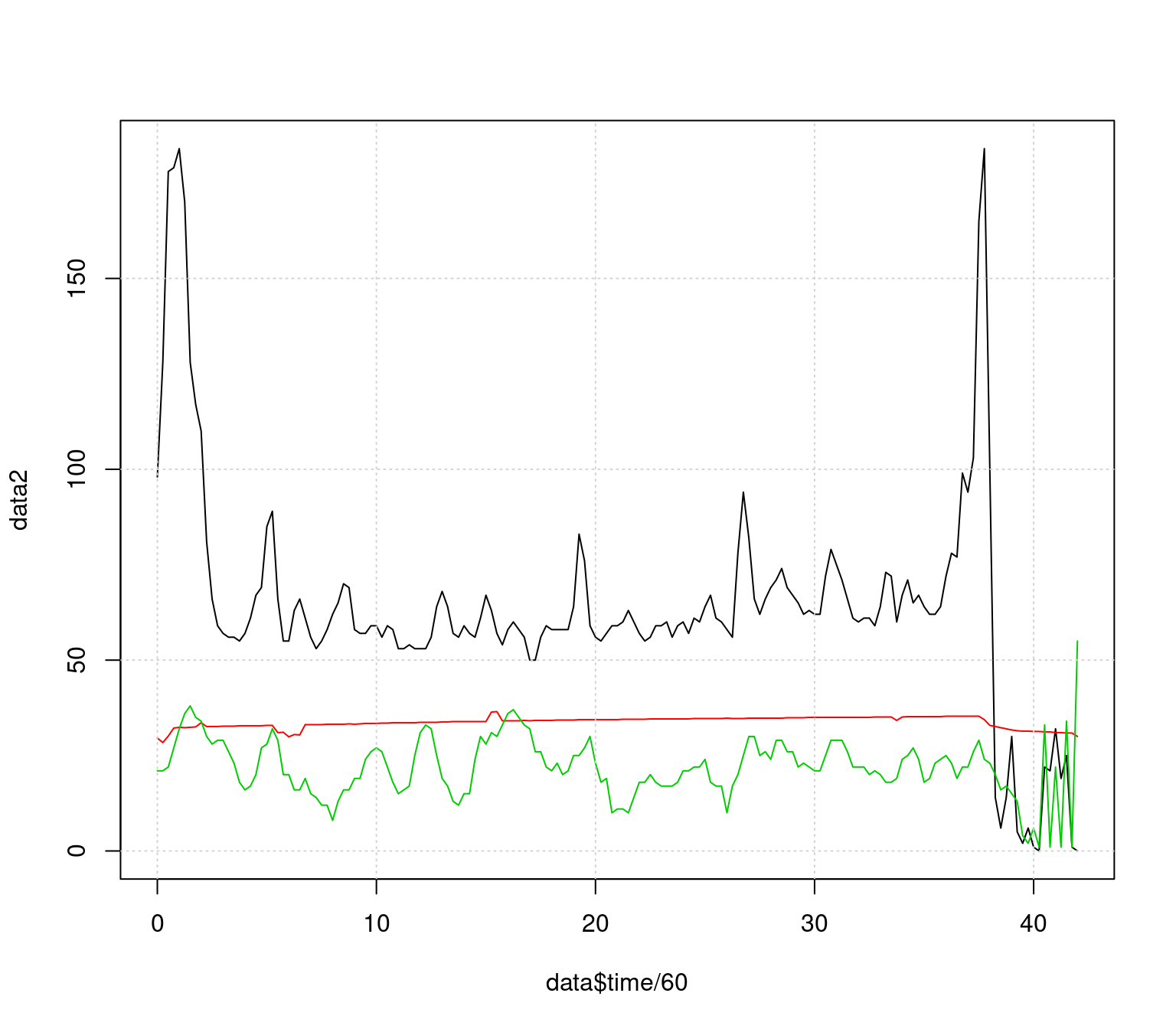
This needs to be cleaned up as well, For now, let’s just filter out the beginning and end points, but we’d like to truncate the range so it doesn’t go above 100 as well. Finally, we’d like a legend to know what the different series are. We will filter a slightly different way this time
keeprows <- 1:169
matplot(data$time[keeprows]/60,data2[keeprows,],type="l",lty=1,
        ylim=c(0,110), lwd=1.5,
        xlab="Time in study (min)",ylab="Measured value")
grid()

legend(6,110,c("Heart rate/min","Temperature (c)","Breathing rate/min"),
       lty=1,col=1:3,lwd=1.5,cex=.8)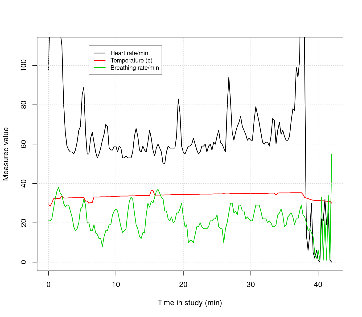
We can overlay a normal points plot on this. Remember that there is an indicator for each row called ‘Alert’, which is either Blue, Green, Yellow, or Red. This gets read in as a factor:
##   [1] Blue   Blue   Blue   Blue   Blue   Blue   Blue   Blue   Blue   Blue   Blue   Blue   Blue   Blue   Blue   Green
##  [17] Green  Green  Green  Blue   Green  Blue   Green  Green  Green  Green  Green  Blue   Green  Green  Green  Green
##  [33] Blue   Green  Blue   Green  Green  Green  Green  Green  Green  Green  Blue   Blue   Blue   Blue   Blue   Blue
##  [49] Green  Green  Green  Green  Green  Blue   Blue   Green  Green  Green  Blue   Blue   Blue   Blue   Blue   Blue
##  [65] Blue   Blue   Blue   Blue   Blue   Blue   Green  Green  Green  Green  Green  Green  Green  Blue   Blue   Blue
##  [81] Blue   Blue   Green  Green  Green  Green  Green  Green  Green  Green  Green  Green  Green  Green  Green  Green
##  [97] Green  Blue   Blue   Blue   Blue   Blue   Green  Green  Green  Green  Green  Blue   Green  Green  Green  Blue
## [113] Blue   Blue   Green  Green  Green  Green  Green  Green  Blue   Green  Green  Blue   Green  Blue   Green  Blue
## [129] Blue   Blue   Blue   Blue   Green  Green  Green  Green  Green  Blue   Blue   Blue   Green  Green  Blue   Blue
## [145] Blue   Blue   Blue   Blue   Green  Green  Green  Red    Green  Yellow Blue   Blue   Yellow Yellow Yellow Yellow
## [161] Yellow Yellow Yellow Yellow Yellow Yellow Yellow Yellow Yellow
## Levels: Blue Green Red Yellow
We can convert these to characters and use them directly for the color. However, since these are factors, they have an implicit order, and we can use the same trick we used before for color and point size, but use the factor level as an index. Then we could use a different set of colors. For example, the default green is almost lime, and I like to use dark green. Here are two methods, both plotted near the bottom.
colors1 <- as.character(data$Alert)
colors2 <- c("blue","darkgreen","red","orange")[data$Alert]

keeprows <- 1:169
matplot(data$time[keeprows]/60,data2[keeprows,],type="l",lty=1,
        ylim=c(0,110), lwd=1.5,
        xlab="Time in study (min)",ylab="Measured value")
grid()

legend(6,110,c("Heart rate/min","Temperature (c)","Breathing rate/min"),
       lty=1,col=1:3,lwd=1.5,cex=.8)


points(data$time[keeprows]/60,
       rep(5,length(keeprows)),
       col=colors2,pch=15,cex=.5)


points(data$time[keeprows]/60,
       rep(0,length(keeprows)),
       col=colors1,pch=15,cex=.5)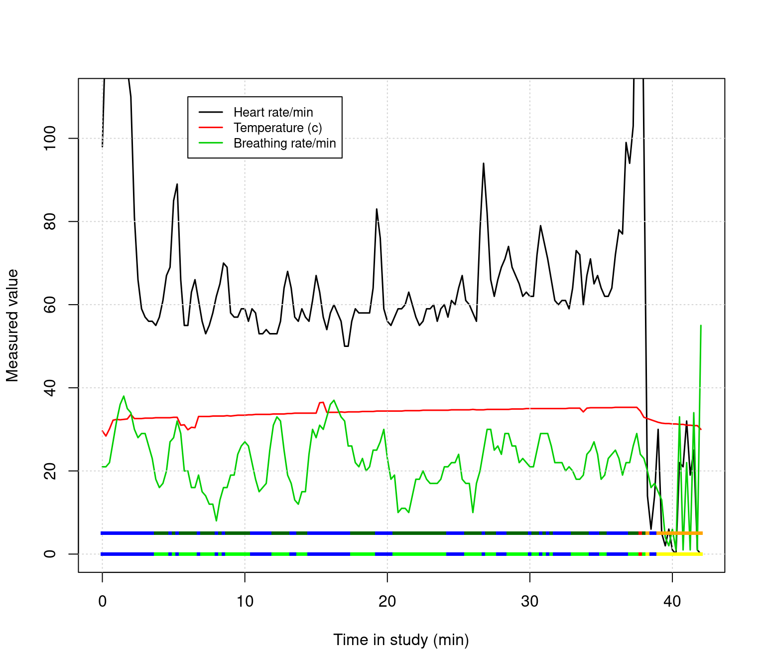
Use the keeprows variable to filter out the beginning and end of the data to remove bad data. Then, instead of plotting the $Alert twice, plot both the $Alert and $PWI variables as separate strips near the bottom. Finally, look up text() in the help, and label these two rows directly. Adjust the x and y range if necessary to fit all the labels you need.
We have actually been making scatterplots all along, but let’s try plotting HR by BR instead of time by HR or time by BR;
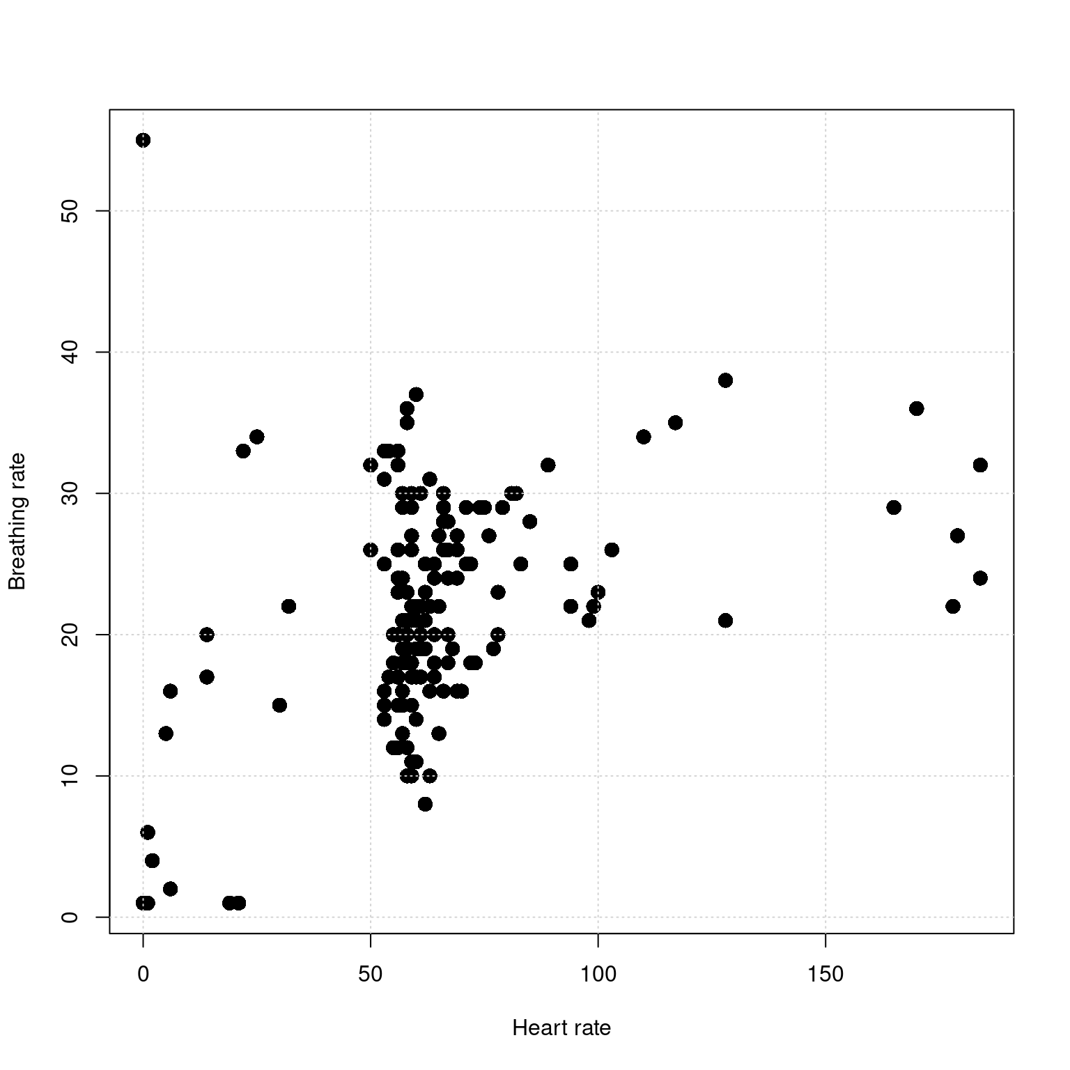
There seems to be some association here, but how much of it comes from the bad data?
For the scatterplot comparing HR and BR, make a plot showing the bad data at the beginning and end as red. Then, filter this out and make another plot. Use the command par(mfrow=c(1,2)) to plot two figures on one page.
Look up the the plot and the par functions in the help, and create a new plot that includes axis labels, a main label, changes this to a line plot or a line + symbol plot, changes the symbol being plotted, and changes the color being plotted.
par(las=1)  ##This turns the temperature numbers horizontal
plot(data$time/60,data$tempC,
     xlab="Time (m)",
     ylab="Temperature (c)",
    main="Skin temperature over time",
    pch=16,      ##Symbol to plot; 16 is filled circle
    type="o",    ##Use overplot of line and circle
    col="navy",  ##use navy blue; hundreds of color names  are available
    bty="L",     ##Make box an L (axes only)
    lwd=2,       ##make line thick
    cex=.75)      ##make point size smaller
grid()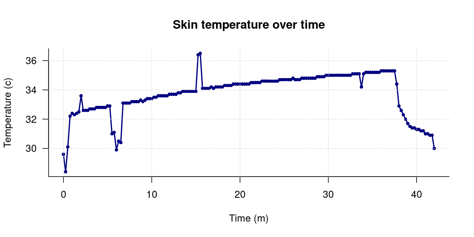
The samples near minute 7 are all less than 31.5, which is 88.7 F; clearly too low for valid data. Similarly, near minute 15, there are two measures above 36, which is higher than all of our data by a large amount. Create another filter based on normal temperature range of 31.5 to 36, and use that to remove any outlying data points.
Here, the easiest thing to do is to count the indexes we want to remove, and set remove.ends to T for these.
remove.for <- c(abs( data$tempC[-1]-data$tempC[-nrow(data)]) >.2,T)
remove.back <- c(T,abs(data$tempC[-nrow(data)]- data$tempC[-1]) >.2)
remove.ends <- rep(F,nrow(data))
remove.ends[1:3] <- T
remove.ends[155:169] <- T

remove.outofbounds <- data$tempC>36 | data$tempC < 31.5

keep <- !((remove.for & remove.back) | remove.ends | remove.outofbounds)

par(las=1)  ##This turns the temperature numbers horizontal
plot(data$time/60,data$tempC,
     xlab="Time (m)",ylab="Temperature (c)",
    main="Skin temperature over time: Filtering automatically",
    pch=c(5,16)[keep+1],       type="p",
    col=c("red","navy")[keep+1],    bty="L",
    cex=c(1,.5)[keep+1]   )

grid()
points(data[keep,]$time/60,data[keep,]$tempC,type="l",lwd=.5,col="grey")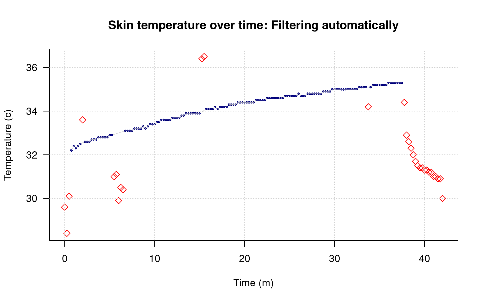
Use the keeprows variable to filter out the beginnig and end of the data to remove bad data. Then, instead of plotting the Alert twice, plot both the Alert and PWI variables as separate strips near the bottom. Finally, look up text() in the help, and label these two rows directly. Adjust the x and y range if necessary to fit all the labels you need.
##Make separate colers for Alert and PWI.
colors1 <- c("blue","green","red","orange")[data$Alert]
colors2 <- c("blue","green","red","orange")[data$PWI]

##Filter out before row 10 and after 150:
keeprows <- 10:150

##Make the regular plots:
matplot(data$time[keeprows]/60,data2[keeprows,],type="l",lty=1,
        ylim=c(0,110), xlim=c(0,40),
        lwd=1.5,
        xlab="Time in study (min)",ylab="Measured value")
grid()

legend(6,110,c("Heart rate/min","Temperature (c)","Breathing rate/min"),
       lty=1,col=1:3,lwd=1.5,cex=.8)


##Make the strips of points at the bottom at rows 5 (Alert) and 0 (PWI)
points(data$time[keeprows]/60,
       rep(5,length(keeprows)),
       col=colors1,pch=15,cex=.5)


points(data$time[keeprows]/60,
       rep(0,length(keeprows)),
       col=colors2,pch=15,cex=.5)


##Use text to label the rows at the bottom.
text(0,5,"Alert")
text(0,0,"PWI")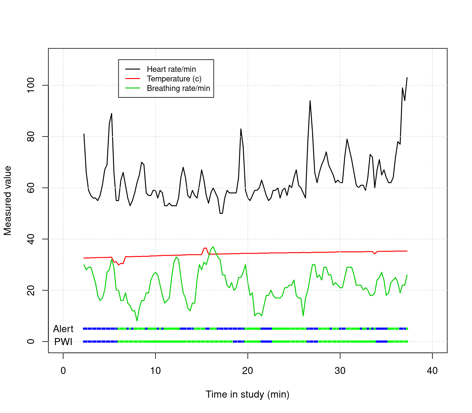
For the scatterplot comparing HR and BR, make a plot showing the bad data at the beginning and end as red. Then, filter this out and make another plot. Use the command par(mfrow=c(1,2)) to plot two figures on one page.
This should be pretty straightforward. We will reuse one of the filter methods we tried before. I also overlaid two points–a filled and unfilled, to give an outline look.
keep <- rep(F,nrow(data))
keep[10:150] <- T

par(mfrow=c(1,2))
plot(data$HR,data$BR,xlab="Heart rate",ylab="Breathing rate",
     main="All data",
     pch=16,cex=1.5,col=c("grey80","red")[2-keep])
grid()
points(data$HR,data$BR,pch=1,cex=1.5,col="black")

plot(data$HR[keep],data$BR[keep],xlab="Heart rate",ylab="Breathing rate",
     pch=16,cex=1.5,col="grey80",
     main="Excluding bad data")
grid()
points(data$HR[keep],data$BR[keep],pch=1,cex=1.5,col="black")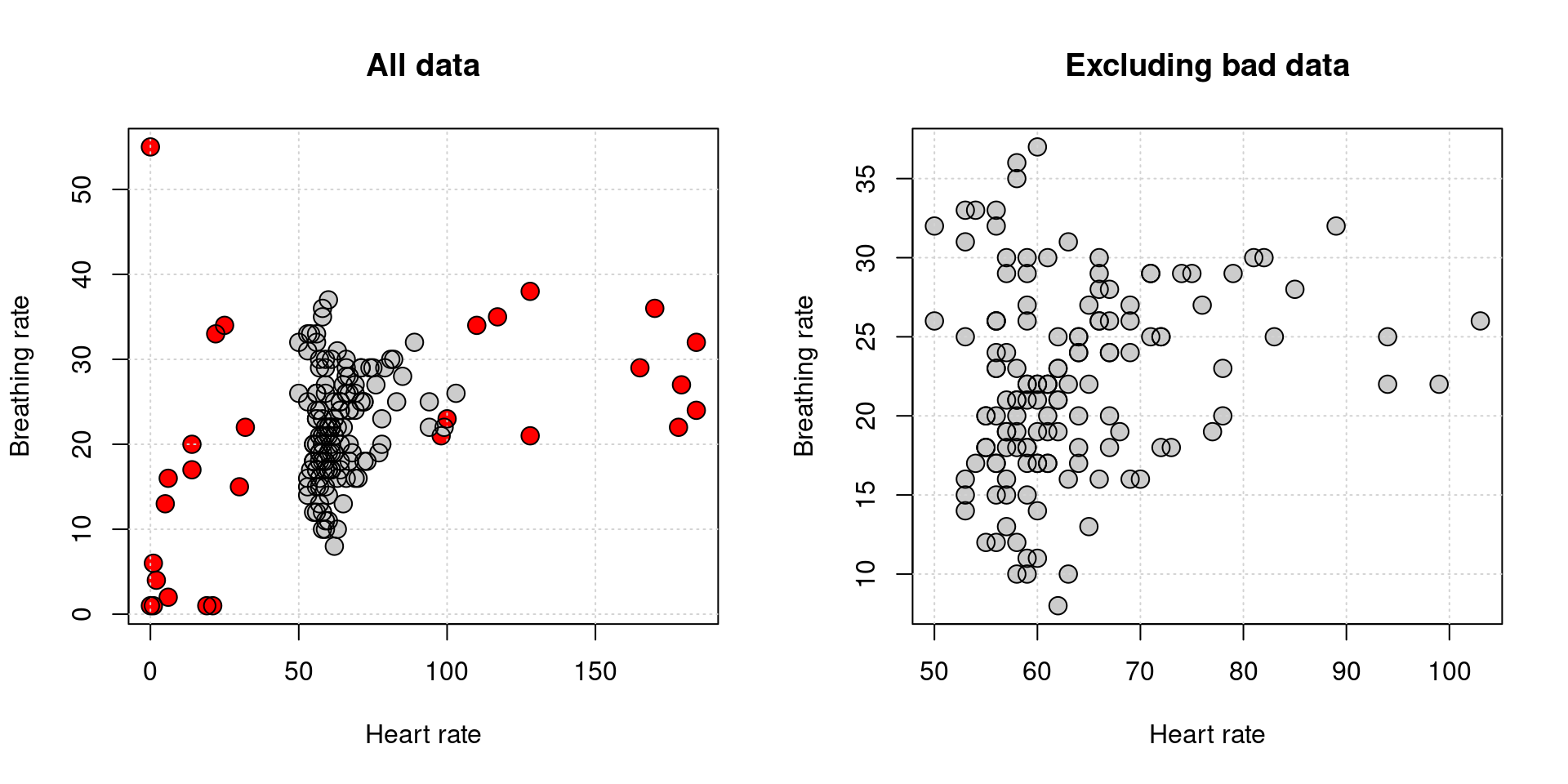
It doesn’t look like there is much of a relationship.